Deep Neural Networks (Part II). Working out and selecting predictors
Contents
- Introduction
- 1. Creating features
- 2. Choosing predictors
- Conclusion
- Application
Introduction
In the previous article we considered different aspects of obtaining and preparing input data and the goal variable. To run the scripts of this article, you either need to execute all the scripts of the first part or load the calculation results from the first part's attachment to RStudio.
1. Creating features
Creating features is a science (and art) of obtaining additional information from the data in hand. Our goal is not to add new data but to make use of what we already have. New capabilities allow us to obtain new features of a data sample. These features enable more precise labeling, characterization and division of the training data set. This provides extra accuracy.
This process can be divided into two stages:
- Transformation. Depending on the scenario, this can be one of four types of transformation: normalizing data, removing skewness of variables, removing outliers and discretization.
- Creating features. Extracting a new variable from the existing ones is called creating a new feature. This can reveal hidden relationships in the data set.
1.1. Feature transformation
1.1.1. Transformation
What is transformation of a variable?
In data modeling, a transformation is a replacement of a variable by a function of that variable. For instance, this could be the changing of the x variable by a square or cube root or logarithm x. In other words, transformation is a process which changes the distribution of a variable and the relationship of this variable with others.
Let us recall when transformation of a variable is useful.
- When we want to change the scale of a variable or standardize its values for better understanding. This transformation is requires if different data have different scales. This does not result in the change of the distribution shape.
- When complex nonlinear and curvilinear relationships between variables have to be transformed into a linear relationship. This is more vivid and provides a better capability to forecast. In such a case, a scatter plot can be used to find a relationship between two continuous variables. A logarithmic transformation is usually used in such a situation.
- When an asymmetrical distribution needs to be changed to a symmetrical one for a simpler interpretation and analysis. Some modeling methods require a normal distribution of variables. Therefore, when we deal with a nonuniform distribution, we can use transformations that reduce skewness. For a right-skewed distribution we take a square or cube root or a logarithm of a variable whereas the left-skewed distribution is smoothed out by squaring/cubing or using the exponential function.
- When a continuous variable needs to be transformed into a discrete one. The method of such a transformation is discretization.
What are the general methods of transformation?
There are various methods used for transforming variables. We have already mentioned some of them: square and cube root, logarithms, trigonometric functions and segmentation. Let us look into some methods in detail and identify their advantages and disadvantages.
- Taking the logarithm. This is a general transformation method used for changing the shape of the distribution of a variable. This is usually used to reduce the right skewness. This function is not applicable to zero and negative values.
- Square/cube root. This function has a significant impact on the distribution of the variable though not as powerful as taking the logarithm. The advantage of the cube root is that it can be used for zero and negative values. The square root can be taken only of positive values and zero.
- Discretization/binning. This is used for categorization of values. Discretization is suitable for original data, percentile and frequencies. The choice of the categorization method is based on the nature of the data. We can carry out a joint segmentation of interdependent variables.
Any transformation of data leads to the change of the distribution. To illustrate this, we will use examples of two transformation methods.
Two problems of our initial data set are outliers and right skewness. We have already considered ways to remove outliers. Now, let us try to remove/reduce the asymmetry first and then remove the outliers.
Method 1.
To get rid of the strong right skewness of the x data set, we will take the logarithm to the base 2 and then remove outliers. As the values of the variables in the initial data set are much smaller than 1 and there are negative values amongst them, we will take logarithms of the variables having added 1 to each of it to increase accuracy. Let us see what will happen to the curve.
evalq({x.ln <- apply(x, 2, function(x) log2(x + 1))
       sk.ln <- skewness(x.ln)},
      env)
 > env$sk.ln
               ftlm      stlm      rbci      pcci   v.fatl
Skewness -0.2715663 -2.660613 -4.484301 0.4267873 1.253008
          v.satl   v.rftl     v.rstl    v.ftlm     v.stlm
Skewness 1.83489 2.065224 -0.0343451 -15.62414 0.01529019
            v.pcci
Skewness 0.1811206
Three variables — stlm, rbci and v.ftlm have a pronounced left skewness. The v.fatl, v.satl and v.rftl variables are still skewed to the right. The skewness of other variables has evened out. Let us remove and impute the outliers from this data set and then look at the skewness and distribution of variables:
evalq({
  foreach(i = 1:ncol(x.ln), .combine = "cbind") %do% {
    remove_outliers(x.ln[ ,i])
  } -> x.ln.out
  colnames(x.ln.out) <- colnames(x.ln)
  },
env)
evalq({
  foreach(i = 1:ncol(x.ln), .combine = "cbind") %do% {
    capping_outliers(x.ln[ ,i])
  } -> x.ln.cap
  colnames(x.ln.cap) <- colnames(x.ln)
},
env)
evalq({
  sk.ln.out <- skewness(x.ln.out)
  sk.ln.cap <- skewness(x.ln.cap)
},
env)
> env$sk.ln.out
              ftlm       stlm       rbci        pcci
Skewness -0.119055 -0.3549119 -0.1099921 -0.01476384
              v.fatl      v.satl      v.rftl     v.rstl
Skewness -0.02896319 -0.03634833 -0.06259749 -0.2120127
              v.ftlm      v.stlm      v.pcci
Skewness -0.05819699 -0.01661317 -0.05420077
> env$sk.ln.cap
               ftlm       stlm       rbci        pcci
Skewness -0.1814781 -0.4582045 -0.1658855 -0.02849945
              v.fatl      v.satl     v.rftl     v.rstl
Skewness -0.04336238 -0.04400781 -0.0692754 -0.2269408
              v.ftlm      v.stlm      v.pcci
Skewness -0.06184128 -0.02856397 -0.06258243
Data in both data sets (x.out and x.cap) are nearly symmetrical. The distribution is shown on the diagrams below.
par(mfrow = c(2,2))
boxplot(env$x.ln,
              main = "x.ln with outliers",
              xlab = "")
boxplot(env$x.ln.out,
              main = "x.ln.out without outliers",
              xlab = "")
boxplot(env$x.ln.cap,
              main = "x.ln.cap with imputed outliers",
              xlab = "")
par(mfrow = c(1,1))
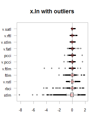

Fig.1. Log-transformed data with and without outliers
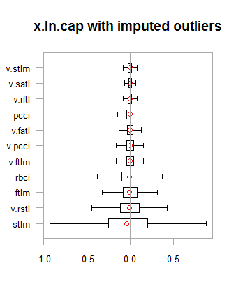
Fig.2. Log-transformed data with outliers imputed
Results are very similar to the previous transformation with one exception. The range of the change of variables has become wider.
Let us transform the x.ln.cap dataframe and see the variation and covariation of the set:
 evalq(x.ln.cap %>% tbl_df() %>%
        cbind(Data = dataSetClean$Data, .,
              Class = dataSetClean$Class) ->
        dataSetLnCap,
      env)
Plot charts:
require(GGally)
evalq(ggpairs(dataSetLnCap, columns = 2:7,
              mapping = aes(color = Class),
              title = "PredLnCap1"),
      env)
evalq(ggpairs(dataSetLnCap, columns = 8:13,
              mapping = aes(color = Class),
              title = "PredLnCap2"),
      env)
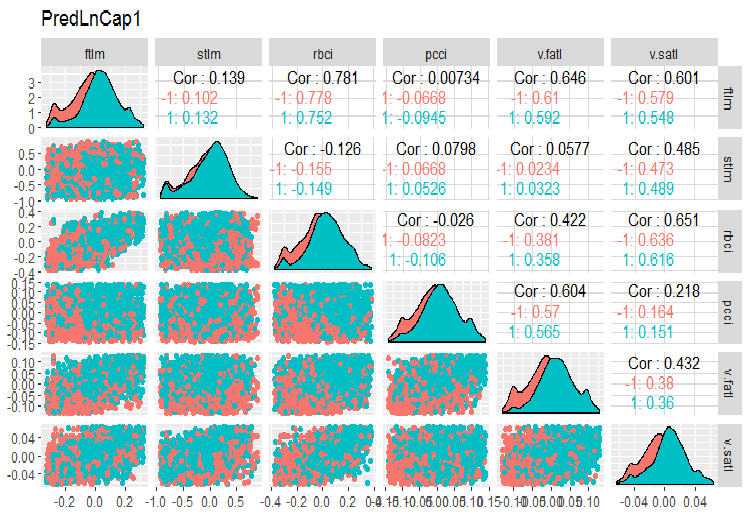
Fig.3. Parameters of log-transformed data, part 1
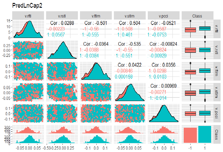
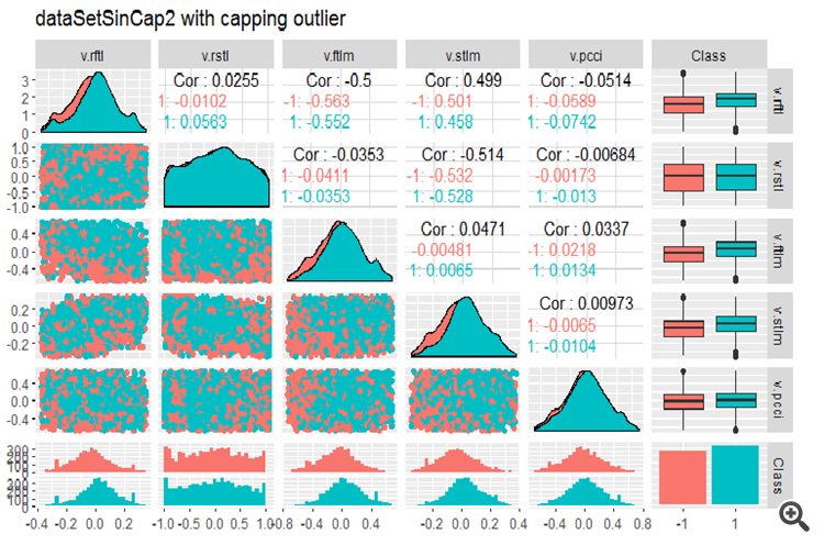
Fig. 4. Parameters of log-transformed data, part 2
Method 2.
Transform the data using the sin(2*pi*x) function, remove and impute outliers and then assess the skewness, distribution of outliers and covariation of transformed variables on charts.
evalq({x.sin <- apply(x, 2, function(x) sin(2*pi*x))
      sk.sin <- skewness(x.sin)
      },
env)
#----------
evalq({
  foreach(i = 1:ncol(x.sin), .combine = "cbind") %do% {
    remove_outliers(x.sin[ ,i])
  } -> x.sin.out
  colnames(x.sin.out) <- colnames(x.sin)
},
env)
#-----------------
evalq({
  foreach(i = 1:ncol(x.sin), .combine = "cbind") %do% {
    capping_outliers(x.sin[ ,i])
  } -> x.sin.cap
  colnames(x.sin.cap) <- colnames(x.sin)
},
env)
#-----------
evalq({
  sk.sin.out <- skewness(x.sin.out)
  sk.sin.cap <- skewness(x.sin.cap)
},
env)
What is the skewness of these transformed data sets?
env$sk.sin
                ftlm        stlm        rbci         pcci
Skewness -0.02536085 -0.04234074 -0.00587189 0.0009679463
             v.fatl    v.satl     v.rftl      v.rstl
Skewness 0.03280465 0.5217757 0.05611136 -0.02825112
             v.ftlm     v.stlm     v.pcci
Skewness 0.04923953 -0.2123434 0.01738377
> env$sk.sin.out
                ftlm        stlm        rbci       pcci
Skewness -0.02536085 -0.04234074 -0.00587189 0.03532892
             v.fatl      v.satl      v.rftl      v.rstl
Skewness 0.00360966 -0.02380975 -0.05336561 -0.02825112
               v.ftlm     v.stlm       v.pcci
Skewness 0.0009366441 0.01835948 0.0008843329
> env$sk.sin.cap
                ftlm        stlm        rbci       pcci
Skewness -0.02536085 -0.04234074 -0.00587189 0.03283132
              v.fatl      v.satl      v.rftl      v.rstl
Skewness 0.007588308 -0.02424707 -0.04106469 -0.02825112
              v.ftlm      v.stlm      v.pcci
Skewness 0.007003051 0.009237835 0.002101687
As you can see, this transformation made all the data sets symmetrical. Let us see what these sets look like:
par(mfrow = c(2, 2))
boxplot(env$x.sin, main = "x.sin with outlier")
abline(h = 0, col = 2)
boxplot(env$x.sin.out, main = "x.sin.out without outlier")
abline(h = 0, col = 2)
boxplot(env$x.sin.cap, main = "x.sin.cap with capping outlier")
abline(h = 0, col = 2)
par(mfrow = c(1, 1))
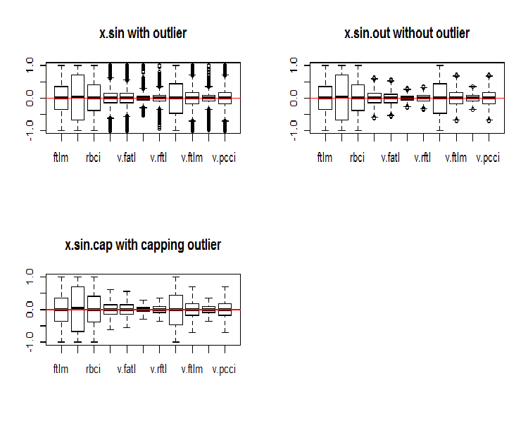
Fig.5. Data set transformed by the sin()function
At first glance, these data sets look better than the previous ones (the initial and transformed ones).
Now, we want to see the distribution of NA in variables after the outliers have been removed.
require(VIM)
evalq(a <- aggr(x.sin.out), env)
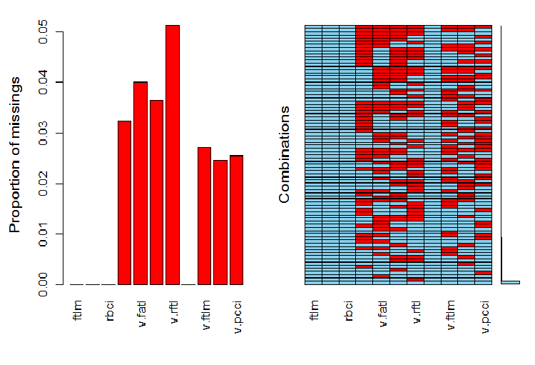
Fig.6. Distribution of NA in the data set
The left part of the chart shows the relative number of undefined data in every variable. The right side shows combinations of examples with a different number of NA (increasing from bottom to top). We can see the values:
> print(env$a)

 Missings in variables:
 Variable Count
     pcci   256
   v.fatl   317
   v.satl   289
   v.rftl   406
   v.ftlm   215
   v.stlm   194
   v.pcci   201
What is the distribution of NA in variables?
 par(mfrow = c(3, 4))
evalq(
  foreach(i = 1:ncol(x.sin.out)) %do% {
    barMiss(x.sin.out, pos = i, only.miss = TRUE,
            main = "x.sin.out without outlier")
  }, env
)
par(mfrow = c(1, 1))
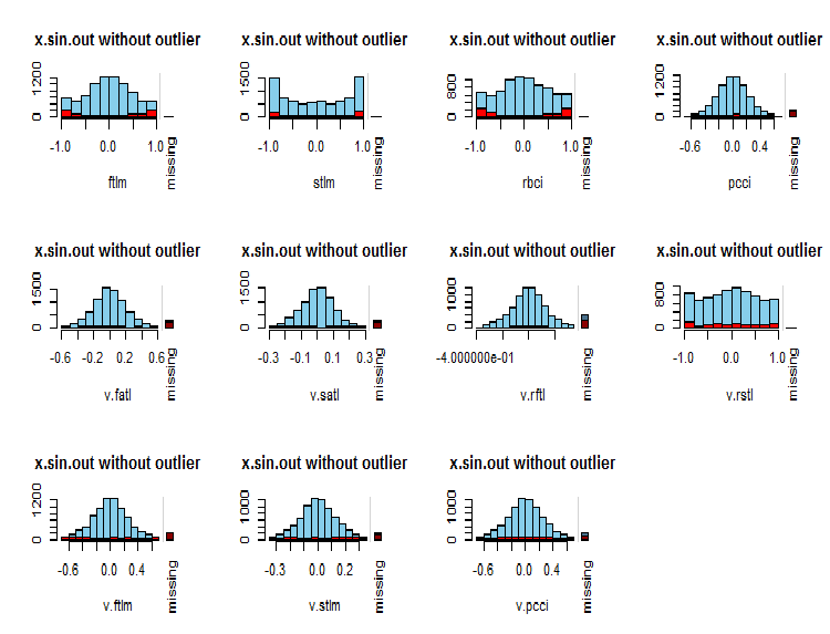
Fig.7. Distribution of NA in variables
Observed values of the variable are shown in blue and the number of NA of other variables in different ranges of the values of the current variable are shown in red. The bar on the right represents the contribution of the current variable to the total number of NA of all variables.
Finally, let us take a look at the variation and covariation of the transformed data set with imputed outliers.
#---------------
evalq(x.sin.cap %>% tbl_df() %>%
        cbind(Data = dataSetClean$Data, .,
              Class = dataSetClean$Class) ->
        dataSetSinCap,
      env)
require(GGally)
evalq(ggpairs(dataSetSinCap, columns = 2:7,
              mapping = aes(color = Class),
              title = "dataSetSinCap1 with capping outlier "),
      env)
evalq(ggpairs(dataSetSinCap, columns = 8:13,
              mapping = aes(color = Class),
              title = "dataSetSinCap2 with capping outlier"),
      env)
#---------------------------
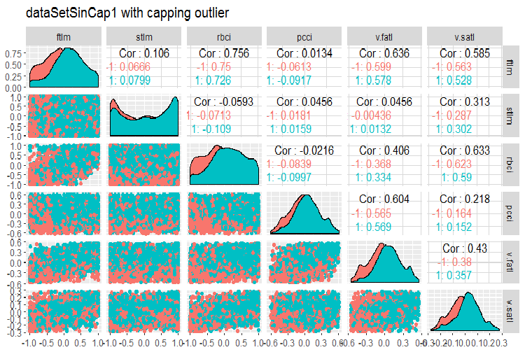
Fig.8. Parameters of sin()-transformed data, part 1
Fig.9. Parameters of sin()-transformed data, part 2
1.1.2. Normalization
We are preparing data for a neural network, hence variables must be brought within the range of { -1..+1 }. For that, the preProcess()::caret function with method = “spatialSign” is going to be used. Alternatively, data can be centered or scaled before normalization. This is a very simple process and we are not going to consider it in this article.
There is one thing to bear in mind though. Parameters of normalization obtained from the training data set are to be used for the test and validation sets.
For further use of the data set we obtained in previous calculations (dataSet without removing highly correlated values), let us divide into train/test/val and bring them within the range (-1,+1) without standardization.
Performing normalization with standardization, keep in mind that when normalization parameters (mean/median, sd/mad) are defined, parameters of imputing outliers are to be defined too. Going forward, they will be used for train/val/test. Earlier in this article we wrote two functions: prep.outlier() and treatOutlier(). They are designed for this purpose.
Sequence of operations:
- Define parameters for outliers in train
- Remove outliers in train
- Define parameters of standardization in train
- Impute outliers in train/val/test
- Normalize train/val/test.
We are not going to consider this variant here. You can study it on your own.
Divide the data into train/val/test:
 evalq(
{
  train = 1:2000
  val = 2001:3000
  test = 3001:4000
  DT <- list()
  list(clean = data.frame(dataSet) %>% na.omit(),
       train = clean[train, ],
       val = clean[val, ],
       test = clean[test, ]) -> DT
}, env)
Define parameters for normalization for the train set and normalize outliers in train/test/val:
 require(foreach)
evalq(
{
 preProcess(DT$train, method = "spatialSign") -> preproc
 list(train = predict(preproc, DT$train),
        val = predict(preproc, DT$val),
        test = predict(preproc, DT$test)
       ) -> DTn
},
env)
Let us take a look at the total statistics of the train set:
 > table.Stats(env$DTn$train %>% tk_xts())
Using column `Data` for date_var.
                     ftlm      stlm      rbci      pcci
Observations    2000.0000 2000.0000 2000.0000 2000.0000
NAs                0.0000    0.0000    0.0000    0.0000
Minimum           -0.5909   -0.7624   -0.6114   -0.8086
Quartile 1        -0.2054   -0.2157   -0.2203   -0.2110
Median             0.0145    0.0246    0.0147    0.0068
Arithmetic Mean    0.0070    0.0190    0.0085    0.0028
Geometric Mean    -0.0316   -0.0396   -0.0332   -0.0438
Quartile 3         0.2139    0.2462    0.2341    0.2277
Maximum            0.6314    0.8047    0.7573    0.7539
SE Mean            0.0060    0.0073    0.0063    0.0065
LCL Mean (0.95)   -0.0047    0.0047   -0.0037   -0.0100
UCL Mean (0.95)    0.0188    0.0333    0.0208    0.0155
Variance           0.0719    0.1058    0.0784    0.0848
Stdev              0.2682    0.3252    0.2800    0.2912
Skewness          -0.0762   -0.0221   -0.0169   -0.0272
Kurtosis          -0.8759   -0.6688   -0.8782   -0.7090
                   v.fatl    v.satl    v.rftl    v.rstl
Observations    2000.0000 2000.0000 2000.0000 2000.0000
NAs                0.0000    0.0000    0.0000    0.0000
Minimum           -0.5160   -0.5943   -0.6037   -0.7591
Quartile 1        -0.2134   -0.2195   -0.1988   -0.2321
Median             0.0015    0.0301    0.0230    0.0277
Arithmetic Mean    0.0032    0.0151    0.0118    0.0177
Geometric Mean    -0.0323   -0.0267   -0.0289   -0.0429
Quartile 3         0.2210    0.2467    0.2233    0.2657
Maximum            0.5093    0.5893    0.6714    0.7346
SE Mean            0.0058    0.0063    0.0062    0.0074
LCL Mean (0.95)   -0.0082    0.0028   -0.0003    0.0033
UCL Mean (0.95)    0.0146    0.0274    0.0238    0.0321
Variance           0.0675    0.0783    0.0757    0.1083
Stdev              0.2599    0.2798    0.2751    0.3291
Skewness          -0.0119   -0.0956   -0.0648   -0.0562
Kurtosis          -1.0788   -1.0359   -0.7957   -0.7275
                   v.ftlm    v.stlm    v.rbci    v.pcci
Observations    2000.0000 2000.0000 2000.0000 2000.0000
NAs                0.0000    0.0000    0.0000    0.0000
Minimum           -0.5627   -0.6279   -0.5925   -0.7860
Quartile 1        -0.2215   -0.2363   -0.2245   -0.2256
Median            -0.0018    0.0092   -0.0015   -0.0054
Arithmetic Mean   -0.0037    0.0036   -0.0037    0.0013
Geometric Mean    -0.0426   -0.0411   -0.0433   -0.0537
Quartile 3         0.2165    0.2372    0.2180    0.2276
Maximum            0.5577    0.6322    0.5740    0.9051
SE Mean            0.0061    0.0065    0.0061    0.0070
LCL Mean (0.95)   -0.0155   -0.0091   -0.0157   -0.0124
UCL Mean (0.95)    0.0082    0.0163    0.0082    0.0150
Variance           0.0732    0.0836    0.0742    0.0975
Stdev              0.2706    0.2892    0.2724    0.3123
Skewness           0.0106   -0.0004   -0.0014    0.0232
Kurtosis          -1.0040   -1.0083   -1.0043   -0.4159
This table shows us that the variables are symmetrical and have very close parameters.
Now, let us take a look at the distribution of variables in the train/val/test sets:
 boxplot(env$DTn$train %>%
          dplyr::select(-c(Data, Class)),
        horizontal = T, main = "Train")
abline(v = 0, col = 2)
boxplot(env$DTn$test %>%
          dplyr::select(-c(Data, Class)),
        horizontal = T, main = "Test")
abline(v = 0, col = 2)
boxplot(env$DTn$val %>%
          dplyr::select(-c(Data, Class)),
        horizontal = T, main = "Val")
abline(v = 0, col = 2)
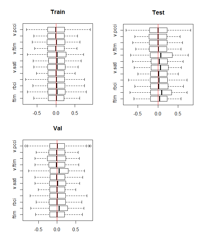
Fig.10. Distribution of variables in the train/val/test sets after normalization
The distribution is nearly the same in all sets. We also have to consider correlation and covariation of the variables in the train: set
require(GGally)
evalq(ggpairs(DTn$train, columns = 2:7,
              mapping = aes(color = Class),
              title = "DTn$train1 "),
      env)
evalq(ggpairs(DTn$train, columns = 8:14,
              mapping = aes(color = Class),
              title = "DTn$train2"),
      env)
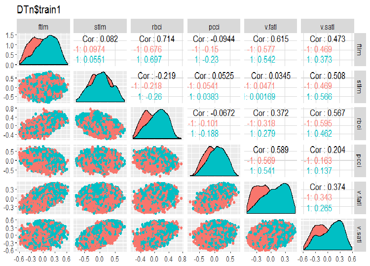
Fig.11. Variation and covariation of the set 1 train
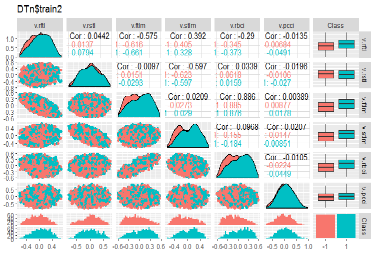
Fig.12. Variation and covariation of the set 2 train
There are no highly correlated data, the distribution is packed and has no outliers. The data can be divided well. On the face of it, there are only two problematic variables - stlm and v.rstl. We will verify this statement later when we assess the relevance of predictors. Now, we can look at the correlation of these predictors and the goal variable:
> funModeling::correlation_table(env$DTn$train %>% tbl_df %>%
+                    select(-Data), str_target = 'Class')
   Variable Class
1     Class  1.00
2    v.fatl  0.38
3      ftlm  0.34
4      rbci  0.28
5    v.rbci  0.28
6    v.satl  0.27
7      pcci  0.24
8    v.ftlm  0.22
9    v.stlm  0.22
10   v.rftl  0.18
11   v.pcci  0.08
12     stlm  0.03
13   v.rstl -0.01
The named variables are at the bottom of the table with very small correlation coefficients. The relevance of the v.pcci. variable also has to be verified. Let us check the v.fatl variable in the train/val/test: sets.
require(ggvis)
evalq(
  DTn$train %>% ggvis(~v.fatl, fill = ~Class) %>%
  group_by(Class) %>%  layer_densities() %>%
  add_legend("fill", title = "DTn$train$v.fatl"),
  env)
evalq(
  DTn$val %>% ggvis(~v.fatl, fill = ~Class) %>%
    group_by(Class) %>%  layer_densities() %>%
    add_legend("fill", title = "DTn$val$v.fatl"),
  env)
evalq(
  DTn$test %>% ggvis(~v.fatl, fill = ~Class) %>%
    group_by(Class) %>%  layer_densities() %>%
    add_legend("fill", title = "DTn$test$v.fatl"),
  env)
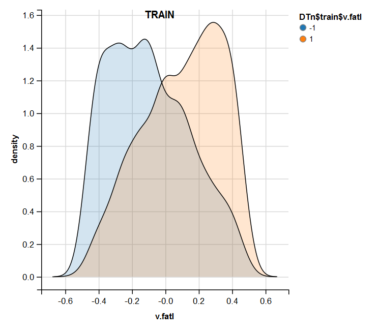
Fig.13. Distribution of the v.fatl variable in the train set after normalization
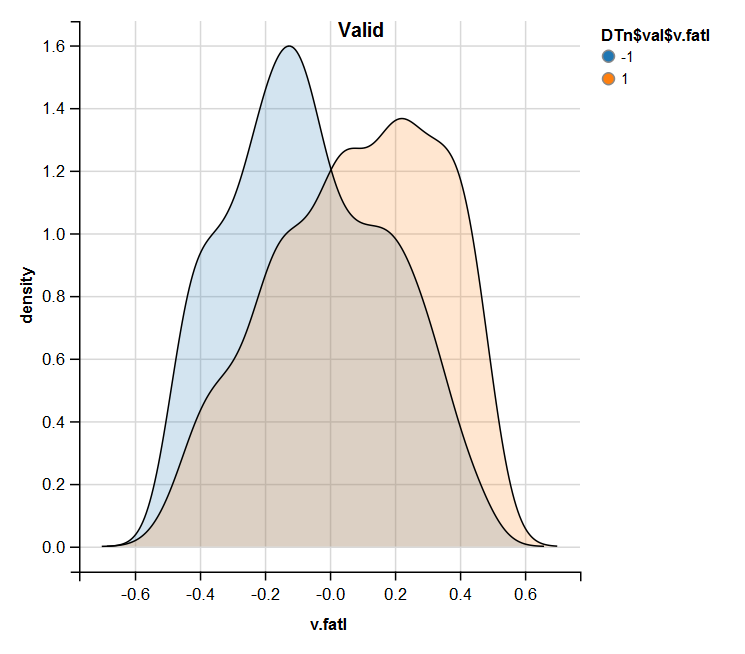
Fig.14. Distribution of the v.fatl variable in the valid set after normalization
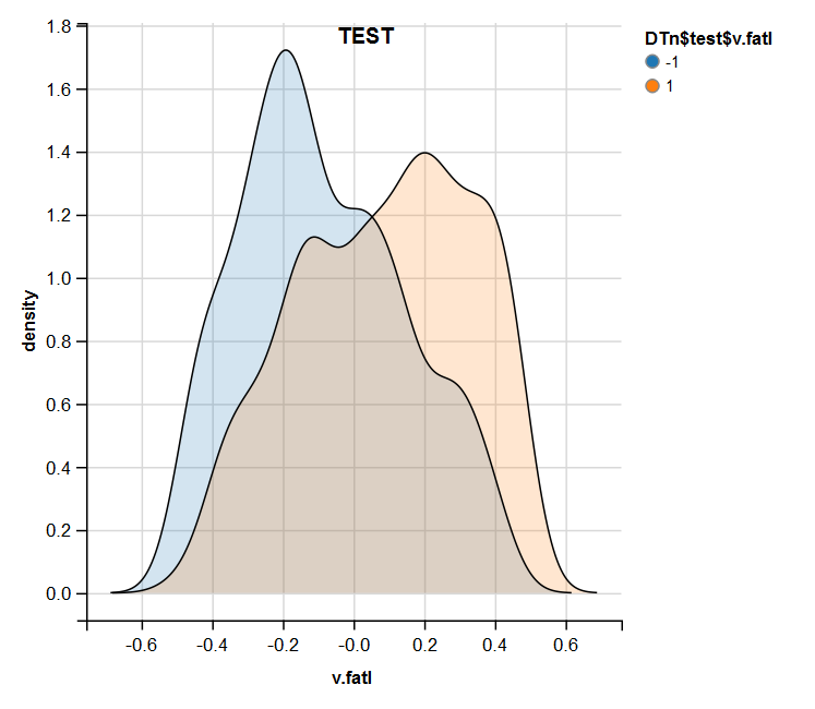
Fig.15. Distribution of the v.fatl variable in the test set after normalization
Performed analysis shows that normalization often produces a good distribution of predictors without outliers and highly correlated data. In large, this depends on the character of the raw data.
1.1.3. Discretization
Discretization refers to the process of transformation of a continuous variable to a discrete one by dividing its values into areas. The boundaries of these areas can be set using various methods.
The separation methods can be divided into two groups: quantitative methods, which do not involve the relationship with the goal variable and methods that take the range of the goal variable into account.
The first group of methods is nearly fully covered by the cut2()::Hmisc function. The sample can be divided into a preset number of areas with specified boundaries, into quartiles, into areas with a minimal number of examples on each and on equifrequent areas.
The second group of methods is more interesting because it divides the variable into areas connected with the levels of the goal variable. Let us consider several packages realizing these methods.
Discretization. This package is a set of algorithms of discretization with trainer. This can also be grouped in terms "from top to bottom" and "from bottom to top", which implement the algorithms of discretization. Let us consider some of them on the example of our dataSet.
At first, we will clean the set (without removing highly correlated variables) and then divide it into train/val/test sets in the ratio 2000/1000/1000.
require(discretization)
require(caret)
require(pipeR)
evalq(
  {
    dataSet %>%
    preProcess(.,
               method = c("zv", "nzv", "conditionalX")) %>%
    predict(., dataSet) %>%
    na.omit -> dataSetClean
    train = 1:2000
    val = 2001:3000
    test = 3001:4000
    DT <- list()
    list(train = dataSetClean[train, ],
         val = dataSetClean[val, ],
         test = dataSetClean[test, ]) -> DT
  },
  env)
We will use the mdlp()::discretization function that describes discretization using minimum description length. This function discretizes continuous attributes of the matrix by the entropy criterion with the minimal description length as the stopping rule.
evalq(
  pipeline({
    DT$train
    select(-Data)
    as.data.frame()
    mdlp()}) -> mdlp.train, envir = env)
The function returns a list with two slots. They are: cutp - a dataframe with cutoff points for each variable and Disc.data - a dataframe with labeled variables.
> env$mdlp.train%>%str()
List of 2
 $ cutp     :List of 12
  ..$ : num [1:2] -0.0534 0.0278
  ..$ : chr "All"
  ..$ : num -0.0166
  ..$ : num [1:2] -0.0205 0.0493
  ..$ : num [1:3] -0.0519 -0.0055 0.019
  ..$ : num 0.000865
  ..$ : num -0.00909
  ..$ : chr "All"
  ..$ : num 0.0176
  ..$ : num [1:2] -0.011 0.0257
  ..$ : num [1:3] -0.03612 0.00385 0.03988
  ..$ : chr "All"
 $ Disc.data:'data.frame':      2000 obs. of  13 variables:
  ..$ ftlm  : int [1:2000] 3 3 3 3 3 2 1 1 1 1 ...
  ..$ stlm  : int [1:2000] 1 1 1 1 1 1 1 1 1 1 ...
  ..$ rbci  : int [1:2000] 2 2 2 2 2 2 1 1 1 1 ...
  ..$ pcci  : int [1:2000] 2 2 1 2 2 1 1 2 3 2 ...
  ..$ v.fatl: int [1:2000] 4 4 3 4 3 1 1 2 3 2 ...
  ..$ v.satl: int [1:2000] 1 1 1 2 2 1 1 1 1 1 ...
  ..$ v.rftl: int [1:2000] 1 2 2 2 2 2 2 2 1 1 ...
  ..$ v.rstl: int [1:2000] 1 1 1 1 1 1 1 1 1 1 ...
  ..$ v.ftlm: int [1:2000] 2 2 1 1 1 1 1 1 2 1 ...
  ..$ v.stlm: int [1:2000] 1 1 1 2 2 1 1 1 1 1 ...
  ..$ v.rbci: int [1:2000] 4 4 3 3 2 1 1 2 3 2 ...
  ..$ v.pcci: int [1:2000] 1 1 1 1 1 1 1 1 1 1 ...
  ..$ Class : Factor w/ 2 levels "-1","1": 2 2 2 2 2 1 1 1 1 1 ...
What does the first slot tell us?
We have three unlabeled variables with the values not connected with the goal variable. These are 2,8 and 12 (stlm, v.rstl, v.pcci). They can be removed without the loss of quality of the data set. Please note that these variables were defined as irrelevant in the previous part of the article.
Four variables are divided into two classes, three variables are divided into three classes and two variables are divided into four classes.
Segment the val/test sets, using cutoff points obtained from the train set. For that, remove the unlabeled variables from the train set and save them into the train.d dataframe. Then, use the findInterval() function to label the test/val set using the cutoff points obtained earlier.
evalq(
  {
    mdlp.train$cutp %>%
    lapply(., function(x) is.numeric(x)) %>%
    unlist -> idx   # bool
    #----train-----------------
    mdlp.train$Disc.data[ ,idx] -> train.d
    #---test------------
    DT$test %>%
      select(-c(Data, Class)) %>%
      as.data.frame() -> test.d

    foreach(i = 1:length(idx), .combine = 'cbind') %do% {
      if (idx[i]) {findInterval(test.d[ ,i],
                   vec = mdlp.train$cutp[[i]],
                   rightmost.closed = FALSE,
                   all.inside = F,
                   left.open = F)}
    } %>% as.data.frame() %>% add(1) %>%
      cbind(., DT$test$Class) -> test.d
    colnames(test.d) <- colnames(train.d)
    #-----val-----------------
    DT$val %>%
      select(-c(Data, Class)) %>%
      as.data.frame() -> val.d
    foreach(i = 1:length(idx), .combine = 'cbind') %do% {
      if (idx[i]) {findInterval(val.d[ ,i],
                                vec = mdlp.train$cutp[[i]],
                                rightmost.closed = FALSE,
                                all.inside = F,
                                left.open = F)}
    } %>% as.data.frame() %>% add(1) %>%
      cbind(., DT$val$Class) -> val.d
    colnames(val.d) <- colnames(train.d)
  },env
)
What do these sets look like?
> env$train.d %>% head()
  ftlm rbci pcci v.fatl v.satl v.rftl v.ftlm v.stlm v.rbci Class
1    3    2    2      4      1      1      2      1      4     1
2    3    2    2      4      1      2      2      1      4     1
3    3    2    1      3      1      2      1      1      3     1
4    3    2    2      4      2      2      1      2      3     1
5    3    2    2      3      2      2      1      2      2     1
6    2    2    1      1      1      2      1      1      1    -1
> env$test.d %>% head()
  ftlm rbci pcci v.fatl v.satl v.rftl v.ftlm v.stlm v.rbci Class
1    1    1    1      2      1      1      1      1      2    -1
2    1    1    3      3      1      1      2      2      3    -1
3    1    1    2      2      1      1      1      2      2    -1
4    2    1    2      3      1      1      2      2      3     1
5    2    2    2      3      1      1      1      2      3     1
6    2    2    2      4      1      1      2      2      3     1
> env$val.d %>% head()
  ftlm rbci pcci v.fatl v.satl v.rftl v.ftlm v.stlm v.rbci Class
1    2    2    2      2      2      2      1      2      2     1
2    2    2    2      2      2      2      1      2      2     1
3    2    2    2      3      2      2      1      2      2     1
4    2    2    2      4      2      2      2      2      3     1
5    2    2    2      3      2      2      1      2      2     1
6    2    2    2      3      2      2      2      2      2     1

> env$train.d$v.fatl %>% table()
.
  1   2   3   4
211 693 519 577
> env$test.d$v.fatl %>% table()
.
  1   2   3   4
 49 376 313 262
> env$val.d$v.fatl %>% table()
.
  1   2   3   4
 68 379 295 258
Further use of the sets with discrete data depends on the model in use. If this is a neural network, predictors will have to be transformed into dummy-variables. How well are these classes divided by these variables? How well do they correlate with the goal variable? Let us make these relationships visual with cross-plot()::funModeling. Cross_plot shows how the input variable correlates with the goal variable receiving the likelihood coefficient for each range of each input.
Let us consider three variables v.fatl, ftlm and v.satl divided into 4, 3 and 2 ranges respectively. Plot charts:
evalq(
  cross_plot(data = train.d,
             str_input = c("v.fatl", "ftlm", "v.satl"),
             str_target = "Class",
             auto_binning = F,
             plot_type = "both"), #'quantity' 'percentual'
  env
  )
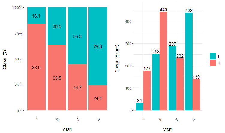
Fig.16. Cross-plot of the v.fatl/Class variable
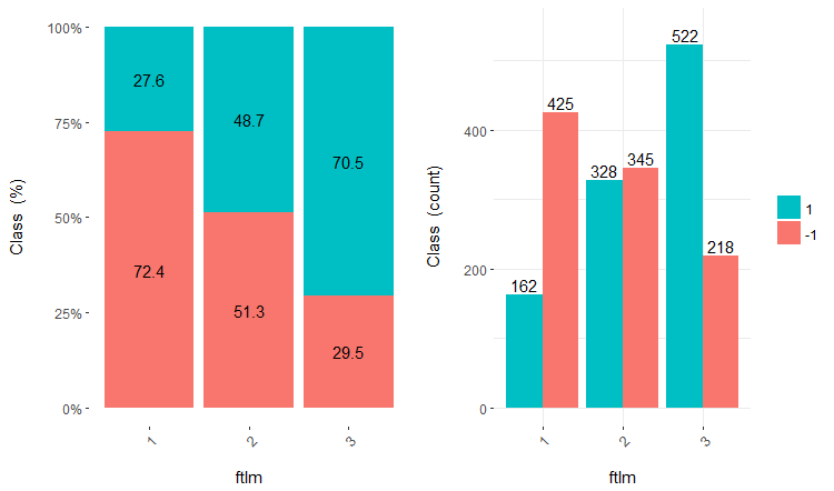
Fig.17. Cross-plot of the ftlm/Class variable
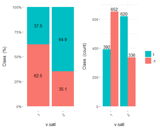
Fig.18. Cross-plot of the v.satl/Class variable
You can see that predictors are well correlated with the levels of the goal variable, have well pronounced thresholds dividing the levels of the Class variable.
Predictors can simply be divided into equal areas (in a non-optimal way) to see in which case they will correlate with the goal variable. Let us divide three previous variables and two bad ones (stlm, v.rstl) from the train set into 10 equifrequent areas and look the their cross-plot with the goal variable:
evalq(
  cross_plot(
      DT$train  %>% select(-Data) %>%
      select(c(v.satl, ftlm, v.fatl, stlm, v.rstl, Class)) %>%
      as.data.frame(),
      str_input = Cs(v.satl, ftlm, v.fatl, stlm, v.rstl),
      str_target = "Class",
      auto_binning = T,
      plot_type = "both"), #'quantity' 'percentual'
  env
)
Plot five charts of these variables:
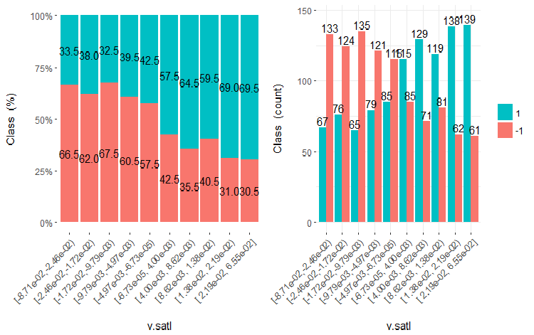
Fig.19. Cross-plot of the v.satl variable (10 areas) vs Class
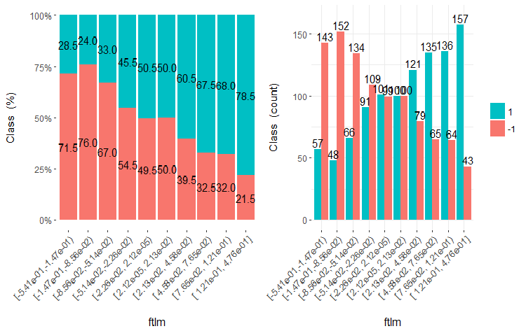
Fig.20. Cross-plot of the ftlml variable (10 areas) vs Class

Fig.21. Cross-plot of the v.fatl variable (10 areas) vs Class
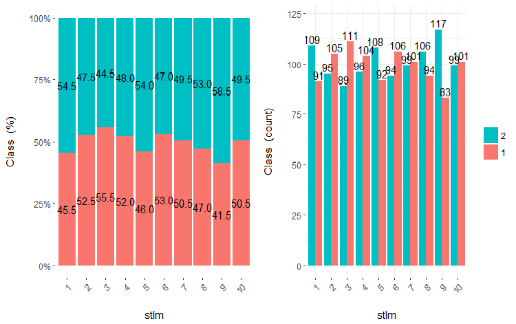
Fig.22. Cross-plot of the stlm variable (10 areas) vs Class
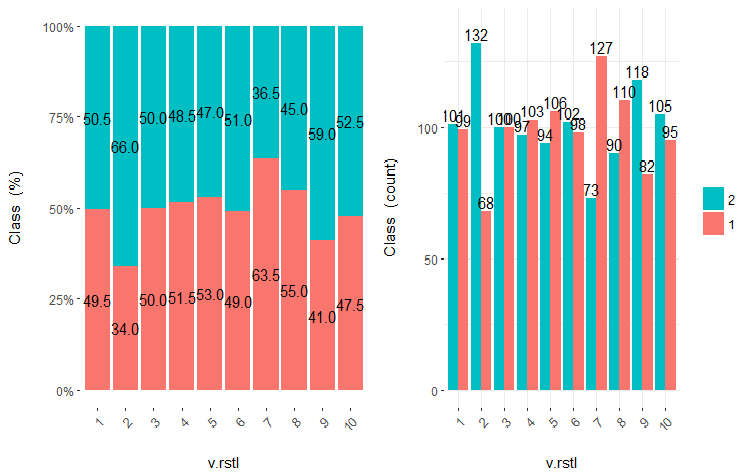
Fig.23. Cross-plot of the v.rstl variable(10 areas) vs Class
It is clear from the diagrams that even when variables were divided into 10 discrete equifrequent areas, the v.fatl, ftlm and v.satl variables have a well pronounced threshold of dividing levels of the variables. It is clear why two other variables (stlm, v.rstl) are irrelevant. This is an efficient way to identify the importance of predictors. We will come back to this later in this article.
Now, let us see how the input variable correlates with the goal variable by comparing them using the Bayesian method posterior conversion rate. It is useful to compare categorical values that do not have an internal order. For that, we will use the bayes_plot::funModeling function. Let us take the v.fatl, ftlm and v.satl variables from the train.d, val.d and test.d sets.
#------BayesTrain-------------------
evalq(
  {
    bayesian_plot(train.d, input = "v.fatl",
                  target = "Class",
                  title = "Bayesian comparison train$v.fatl/Class",
                  plot_all = F, extra_above = 5,
                  extra_under = 5)
  },env
)
evalq(
  {
    bayesian_plot(train.d, input = "ftlm",
                  target = "Class",
                  title = "Bayesian comparison train$ftlm/Class",
                  plot_all = F, extra_above = 5,
                  extra_under = 5)
  },env
)
evalq(
  {
    bayesian_plot(train.d, input = "v.satl",
                  target = "Class",
                  title = "Bayesian comparison train$v.satl/Class",
                  plot_all = F, extra_above = 5,
                  extra_under = 5)
  },env
)
#------------BayesTest------------------------
evalq(
  {
    bayesian_plot(test.d, input = "v.fatl",
                  target = "Class",
                  title = "Bayesian comparison test$v.fatl/Class",
                  plot_all = F, extra_above = 5,
                  extra_under = 5)
  },env
)
evalq(
  {
    bayesian_plot(test.d, input = "ftlm",
                  target = "Class",
                  title = "Bayesian comparison test$ftlm/Class",
                  plot_all = F, extra_above = 5,
                  extra_under = 5)
  },env
)
evalq(
  {
    bayesian_plot(test.d, input = "v.satl",
                  target = "Class",
                  title = "Bayesian comparison test$v.satl/Class",
                  plot_all = F, extra_above = 5,
                  extra_under = 5)
  },env
)
#-------------BayesVal---------------------------------
evalq(
  {
    bayesian_plot(val.d, input = "v.fatl",
                  target = "Class",
                  title = "Bayesian comparison val$v.fatl/Class",
                  plot_all = F, extra_above = 5,
                  extra_under = 5)
  },env
)
evalq(
  {
    bayesian_plot(val.d, input = "ftlm",
                  target = "Class",
                  title = "Bayesian comparison val$ftlm/Class",
                  plot_all = F, extra_above = 5,
                  extra_under = 5)
  },env
)
evalq(
  {
    bayesian_plot(val.d, input = "v.satl",
                  target = "Class",
                  title = "Bayesian comparison val$v.satl/Class",
                  plot_all = F, extra_above = 5,
                  extra_under = 5)
  },env
)
#------------------------------------------
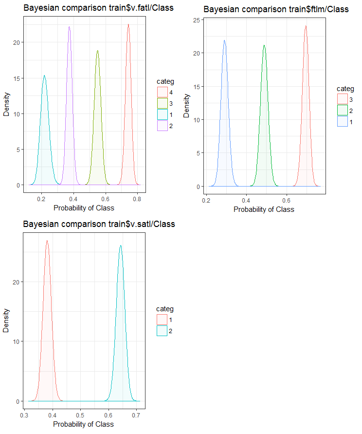
Fig.24. Bayesian comparison of variables with the goal variable in the train set
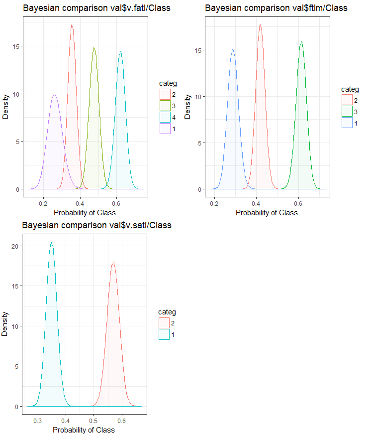
Fig.25. Bayesian comparison of variables with the goal variable in the val set
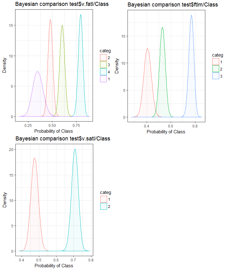
Fig.26. Bayesian comparison of variables with the goal variable in the test set
We can see that the correlation of predictors with the goal variable is drifting more in the variable with 4 levels and more. This drift is smaller in the variables with two groups. Going forward, it will be useful to check how the accuracy of the model will be affected by using only two-range predictors.
The same task of splitting a variable into areas closely fitting the levels of the goal variable can be solved another way - by using the smbinning package. You can check it yourself. The previous article considers another interesting method of discretization. It can be implemented using the "RoughSets" package.
Discretization is an efficient method of transforming predictors. Unfortunately, not all the models can work with factor predictors.
1.2. Creating new features
Creating a variable is a process of creating new variables based on the existing ones. Let us look at the data set where date (dd-mm-yy) is an input variable. We can create new variables which will be better connected with the goal variable- day, months, year, day of the week. This step is used to reveal hidden relationships in the variable.
Creating derivative variables refers to the process of creating a new variable using a set of functions and various methods from an existing variable. The type of the variable to create depends on the curiosity of the business analyst, the set of hypotheses and their theoretical knowledge. The choice of methods is extensive. Taking the logarithm, segmentation, raising to the nth power are only few examples of the transformation methods.
Creating dummy variables is another popular method of working with variables. Usually dummy variables are used in the transformation of categorical variables into numerical ones. The categorical variable can take values of 0 and 1. We can create dummy variables for more than two classes of categorical variables with N and N-1 variables.
In this article we discuss situations that we come across on a daily basis as analysts. Listed below are several ways to extract maximum information from a data set.
- Use the values of data and time as variables. New variables can be created by taking into account differences in date and time.
- Create new ratios and proportions. Instead of storing past inputs and outputs in the data set, their ratios can be included. This may have a greater significance.
- Use standard transformations. Looking at the fluctuations and areas of the variable together with the output, we can see if correlation will improve after basic transformations. Most frequently used transformations are log, exp, square and trigonometric variations.
- Check variables for seasonality and create a model for the required period (week, month, session etc).
It is intuitive that the behavior of the market on Monday is different to the one on Wednesday and Thursday. This means that the day of the week is an important feature. Time of the day is equally as important for market. This defines if this is the Asian, European or American session. How can we define these features?
We will use the timekit package for that. tk_augment_timeseries_signature() is the central function of the package. This adds to the time labels of the initial data set pr the whole row of time data that can be useful as both additional features and parameters of the group. What data are they?
| Index | the value of the index that was resolved |
| Index.num | the numeric value of the index in seconds. Base “1970-01-01 00:00:00” |
| diff | difference in seconds with the previous numeric value of the index |
| Year | year, index component |
| half | half of the index component |
| quarter | quarter, index component |
| month | month, index component with the base 1 |
| month.xts | month, index component with the base 0, same as implemented in xts |
| month.lbl | month label as the ordered factor. Starts in January and ends in December |
| day | day, index component |
| hour | hour, index component |
| minute | minute, index component |
| second | second, index component |
| hour12 | hour component in the 12-hour scale |
| am.pm | morning (am) = 1, afternoon (pm) = 2 |
| wday | day of the week with the base 1 Sunday = 1, Saturday = 7 |
| wday.xts | day of the week with the base 0, same as implemented in xts. Sunday = 0, Saturday = 6 |
| wday.lbl | label of the day of the week as the ordered factor. Starts on Sunday and ends on Saturday |
| mday | day of the month |
| qday | day of the quarter |
| yday | day of the year. |
| mweek | week of the month |
| week | number of the week in a year (starts with Sunday) |
| week.iso | number of the week in a year according to ISO (Starts on Monday) |
| week2 | module for fortnight frequency |
| week3 | module for three-weekly frequency |
| week4 | module for quad-weekly frequency |
Let us take the initial data set pr, strengthen it with the tk_augment_timeseries_signature() function, add to the initial data set the mday, wday.lbl, hour, variables, remove undefined variables (NA) and group data by days of the week.
evalq(
  {
    tk_augment_timeseries_signature(pr) %>%
    select(c(mday, wday.lbl,  hour)) %>%
    cbind(pr, .) -> pr.augm
    pr.compl <- pr.augm[complete.cases(pr.augm), ]
    pr.nest <- pr.compl %>% group_by(wday.lbl) %>% nest()
  },
  env)
> str(env$pr.augm)
'data.frame':   8000 obs. of  33 variables:
 $ Data    : POSIXct, format: "2017-01-10 11:00:00" ...
 $ Open    : num  123 123 123 123 123 ...
 $ High    : num  123 123 123 123 123 ...
 $ Low     : num  123 123 123 123 123 ...
 $ Close   : num  123 123 123 123 123 ...
 $ Vol     : num  3830 3360 3220 3241 3071 ...
 ..................................................
 $ zigz    : num  123 123 123 123 123 ...
 $ dz      : num  NA -0.0162 -0.0162 -0.0162 -0.0162 ...
 $ sig     : num  NA -1 -1 -1 -1 -1 -1 -1 -1 -1 ...
 $ mday    : int  10 10 10 10 10 10 10 10 10 10 ...
 $ wday.lbl: Ord.factor w/ 7 levels "Sunday"<"Monday"<..: 3 3 3 3 3 3 3 3 3 3 ...
 $ hour    : int  11 11 11 11 12 12 12 12 13 13 ...
Same result can be reached if we use the lubridate library, having deleted data for Saturday.
require(lubridate)
evalq({pr %>% mutate(.,
                     wday = wday(Data), #label = TRUE, abbr = TRUE),
                     day = day(Data),
                     hour = hour(Data)) %>%
    filter(wday != "Sat") -> pr1
  pr1.nest <- pr1 %>% na.omit %>%
    group_by(wday) %>% nest()},
  env
)
#-------
str(env$pr1)
'data.frame':   7924 obs. of  33 variables:
 $ Data  : POSIXct, format: "2017-01-10 11:00:00" ...
 $ Open  : num  123 123 123 123 123 ...
 $ High  : num  123 123 123 123 123 ...
 $ Low   : num  123 123 123 123 123 ...
 $ Close : num  123 123 123 123 123 ...
 $ Vol   : num  3830 3360 3220 3241 3071 ...
 ..........................................
 $ zigz  : num  123 123 123 123 123 ...
 $ dz    : num  NA -0.0162 -0.0162 -0.0162 -0.0162 ...
 $ sig   : num  NA -1 -1 -1 -1 -1 -1 -1 -1 -1 ...
 $ wday  : int  3 3 3 3 3 3 3 3 3 3 ...
 $ day   : int  10 10 10 10 10 10 10 10 10 10 ...
 $ hour  : int  11 11 11 11 12 12 12 12 13 13 ...
Data grouped by the days of the week look as follows (Sunday = 1, Monday = 2 and so on):
> env$pr1.nest
# A tibble: 5 × 2
   wday                  data
  <int>                <list>
1     4 <tibble [1,593 Ч 32]>
2     5 <tibble [1,632 Ч 32]>
3     6 <tibble [1,624 Ч 32]>
4     2 <tibble [1,448 Ч 32]>
5     3 <tibble [1,536 Ч 32]>
Additionally, the dL, dH variables from the pr data set can be used on the last three bars.
2. Choosing predictors
There are many ways and criteria of assessing the importance of predictors. Some of them were considered in the previous articles. Since in this article the emphasis is on the visualization, let us compare one visual and one analytical method of ealuating the importance of predictors.
2.1. Visual evaluation
We will use the smbinning package. Earlier, we used the funModeling package to assess predictors. We came to conclusion that visualization of a relationship is a simple and reliable way of identifying relevance of predictors. We are going to test how the smbinning package will handle normalized and transformed data. We will also find out how the transformation of predictors impacts their importance.
Gather in one set log-transformed, sin-transformed, tanh-transformed and normalized data and assess the dependence of the goal variable and predictors in these sets.
The sequence of processing of the primary set (shown on the diagram below)is as follows: clean the raw data in the dataSet (without removing highly correlated data), divide dataSet into the train/val/test sets and get the DT set. Then carry out actions for each type of transformation according to the block diagram below. Let us gather everything in one script:
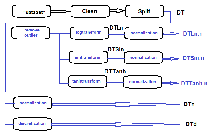
Fig.27. Block diagram of preliminary processing
Clean the set, divide it into train/val/test sets and remove unnecessary data:
#----Clean---------------------
require(caret)
require(pipeR)
evalq(
  {
    train = 1:2000
    val = 2001:3000
    test = 3001:4000
    DT <- list()
    dataSet %>%
      preProcess(., method = c("zv", "nzv", "conditionalX")) %>%
      predict(., dataSet) %>%
      na.omit -> dataSetClean
    list(train = dataSetClean[train, ],
         val = dataSetClean[val, ],
         test = dataSetClean[test, ]) -> DT
    rm(dataSetClean, train, val, test)
  },
  env)
Process all outliers in all sets:
#------outlier-------------
evalq({
# define the new list for the result
  DTcap <- list()
# go through the three sets
  foreach(i = 1:3) %do% {
    DT[[i]] %>%
# remove columns with (Data, Class)
      select(-c(Data, Class)) %>%
# transform into data.frame and store in the temporary variable x
      as.data.frame() -> x
    if (i == 1) {
# define parameters of outliers in the first input
      foreach(i = 1:ncol(x), .combine = "cbind") %do% {
        prep.outlier(x[ ,i]) %>% unlist()
      } -> pre.outl
      colnames(pre.outl) <- colnames(x)
    }
# substitute outliers for 5/95 % and store the result in x.cap
    foreach(i = 1:ncol(x), .combine = "cbind") %do% {
      stopifnot(exists("pre.outl", envir = env))
      lower = pre.outl['lower.25%', i]
      upper = pre.outl['upper.75%', i]
      med = pre.outl['med', i]
      cap1 = pre.outl['cap1.5%', i]
      cap2 = pre.outl['cap2.95%', i]
      treatOutlier(x = x[ ,i], impute = T, fill = T,
                   lower = lower, upper = upper,
                   med = med, cap1 = cap1, cap2 = cap2)
      } %>% as.data.frame() -> x.cap
    colnames(x.cap) <- colnames(x)
    return(x.cap)
  } -> Dtcap
#remove unnecessary variables
  rm(lower, upper, med, cap1, cap2, x.cap, x)
}, env)
Transform variables in all Dtcap sets without the outliers with the log(x+1) function. Get the DTLn list with three sets of log-transformed variables.
#------logtrans------------
evalq({
  DTLn <- list()
  foreach(i = 1:3) %do% {
    DTcap[[i]] %>%
      apply(., 2, function(x) log2(x + 1)) %>%
      as.data.frame() %>%
      cbind(., Class = DT[[i]]$Class)
  } -> DTLn
},
env)
Transform variables in all Dtcap sets without the outliers with the sin(2*pi*x) function. Get the DTSin list with three sets of sin-transformed variables.
#------sintrans--------------
evalq({
  DTSin <- list()
  foreach(i = 1:3) %do% {
    DTcap[[i]] %>%
      apply(., 2, function(x) sin(2*pi*x)) %>%
      as.data.frame() %>%
      cbind(., Class = DT[[i]]$Class)
  } -> DTSin
},
env)
Transform variables in all Dtcap sets without outliers with the tanh(x) function. Get the DTTanh list with three sets of tanh-transformed variables.
#------tanhTrans----------
evalq({
  DTTanh <- list()
  foreach(i = 1:3) %do% {
    DTcap[[i]] %>%
      apply(., 2, function(x) tanh(x)) %>%
      as.data.frame() %>%
      cbind(., Class = DT[[i]]$Class)
  } -> DTTanh
},
env)
Normalize the DT, DTLn, DTSin, DTTanh sets.
#------normalize-----------
evalq(
  {
# define parameters of normalization
    preProcess(DT$train, method = "spatialSign") -> preproc
    list(train = predict(preproc, DT$train),
         val = predict(preproc, DT$val),
         test = predict(preproc, DT$test)
 ) -> DTn
  },
  env)
#--ln---
evalq(
  {
    preProcess(DTLn[[1]], method = "spatialSign") -> preprocLn
    list(train = predict(preprocLn, DTLn[[1]]),
         val = predict(preprocLn, DTLn[[2]]),
         test = predict(preprocLn, DTLn[[3]])
    ) -> DTLn.n
  },
  env)
#---sin---
evalq(
  {
    preProcess(DTSin[[1]], method = "spatialSign") ->  preprocSin
    list(train = predict(preprocSin, DTSin[[1]]),
         val = predict(preprocSin, DTSin[[2]]),
         test = predict(preprocSin, DTSin[[3]])
    ) -> DTSin.n
  },
  env)
#-----tanh-----------------
evalq(
  {
    preProcess(DTTanh[[1]], method = "spatialSign") -> preprocTanh
    list(train = predict(preprocTanh, DTTanh[[1]]),
         val = predict(preprocTanh, DTTanh[[2]]),
         test = predict(preprocTanh, DTTanh[[3]])
    ) -> DTTanh.n
  },
  env)
Use the mdlp::discretization function to discretize the DT set
##------discretize----------
#--------preCut---------------------
# define the cutpoints
require(pipeR)
require(discretization)
evalq(
  #require(pipeR)
# takes some time !
  pipeline({
    DT$train
    select(-Data)
    as.data.frame()
    mdlp()
  }) -> mdlp.train,
  env)
#-------cut_opt----------
evalq(
  {
    DTd <- list()
    mdlp.train$cutp %>%
# define the columns that have to be discretized
      lapply(., function(x) is.numeric(x)) %>%
      unlist -> idx   # bool
    #----train-----------------
    mdlp.train$Disc.data[ ,idx] -> DTd$train
    #---test------------
    DT$test %>%
      select(-c(Data, Class)) %>%
      as.data.frame() -> test.d
# rearrange data according to calculated ranges
    foreach(i = 1:length(idx), .combine = 'cbind') %do% {
      if (idx[i]) {
        findInterval(test.d[ ,i],
        vec = mdlp.train$cutp[[i]],
        rightmost.closed = FALSE,
        all.inside = F,
        left.open = F)
        }
    } %>% as.data.frame() %>% add(1) %>%
      cbind(., DT$test$Class) -> DTd$test
    colnames(DTd$test) <- colnames(DTd$train)
    #-----val-----------------
    DT$val %>%
      select(-c(Data, Class)) %>%
      as.data.frame() -> val.d
# rearrange data according to calculated ranges
    foreach(i = 1:length(idx), .combine = 'cbind') %do% {
      if (idx[i]) {
        findInterval(val.d[ ,i],
        vec = mdlp.train$cutp[[i]],
        rightmost.closed = FALSE,
        all.inside = F,
        left.open = F)
        }
    } %>% as.data.frame() %>% add(1) %>%
      cbind(., DT$val$Class) -> DTd$val
    colnames(DTd$val) <- colnames(DTd$train)
# tidy up
    rm(test.d, val.d)
  },
  env
)
Let us recall what variables the original data set DT$train contains:
require(funModeling)
plot_num(env$DT$train %>% select(-Data), bins = 20)
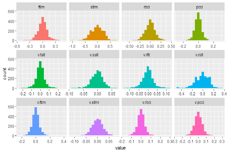
Fig.28. Distribution of variables in the DT$train data set
Use the capabilities of the smbinning package to identify relevant predictors in the train subsets of all normalized data sets obtained earlier (Dtn, DTLn.n, DTSin.n and DTTanh.n). The goal variable in this package must be numeric and have values (0, 1). Let us write a function for necessary conversions.
#--------------------------------
require(smbinning)
targ.int <- function(x){
  x %>% tbl_df() %>%
  mutate(Cl = (as.numeric(Class) - 1) %>%
           as.integer()) %>%
  select(-Class) %>% as.data.frame()
}
Additionally, this package does not accept variables that have a dot in the name. The function below will rename all variables with a dot into variables with an underscore.
renamepr <- function(X){
  X %<>% rename(v_fatl = v.fatl,
               v_satl = v.satl,
               v_rftl = v.rftl,
               v_rstl = v.rstl,
               v_ftlm = v.ftlm,
               v_stlm = v.stlm,
               v_rbci = v.rbci,
               v_pcci = v.pcci)
  return(X)
}
Calculate and plot charts with relevant predictors.
par(mfrow = c(2,2))
#--Ln--------------
evalq({
  df <- renamepr(DTLn.n[[1]]) %>% targ.int
  sumivt.ln.n = smbinning.sumiv(df = df, y = 'Cl')
  smbinning.sumiv.plot(sumivt.ln.n, cex = 0.7)
  rm(df)
},
env)
#---Sin-----------------
evalq({
  df <- renamepr(DTSin.n[[1]]) %>% targ.int
  sumivt.sin.n = smbinning.sumiv(df = df, y = 'Cl')
  smbinning.sumiv.plot(sumivt.sin.n, cex = 0.7)
  rm(df)
  },
env)
#---norm-------------
evalq({
  df <- renamepr(DTn[[1]]) %>% targ.int
  sumivt.n = smbinning.sumiv(df = df, y = 'Cl')
  smbinning.sumiv.plot(sumivt.n, cex = 0.7)
  rm(df)
  },
env)
#-----Tanh----------------
evalq({
  df <- renamepr(DTTanh.n[[1]]) %>% targ.int
  sumivt.tanh.n = smbinning.sumiv(df = df, y = 'Cl')
  smbinning.sumiv.plot(sumivt.tanh.n, cex = 0.7)
  rm(df)
  },
env)
par(mfrow = c(1,1))
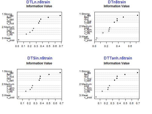
Fig.29. Importance of predictors in the train subset of normalized sets
The five predictors v_fatl, ftlm, v_satl, rbci, v_rbci are strong in all sets, though their order differ. The four predictors pcci, v_ftlm, v_stlm, v_rftl have average strength. Predictors v_pcci and stlm are weak. Distribution of variables can be seen for each set in the order of their importance:
env$sumivt.ln.n
     Char     IV               Process
5  v_fatl 0.6823    Numeric binning OK
1    ftlm 0.4926    Numeric binning OK
6  v_satl 0.3737    Numeric binning OK
3    rbci 0.3551    Numeric binning OK
11 v_rbci 0.3424    Numeric binning OK
10 v_stlm 0.2591    Numeric binning OK
4    pcci 0.2440    Numeric binning OK
9  v_ftlm 0.2023    Numeric binning OK
7  v_rftl 0.1442    Numeric binning OK
12 v_pcci 0.0222    Numeric binning OK
2    stlm     NA No significant splits
8  v_rstl     NA No significant splits
The last three variables can be discarded. This way only five strongest and four average ones will be left. Let us define the names of the best variables (IV > 0.1).
evalq(sumivt.sin.n$Char[sumivt.sin.n$IV > 0.1] %>%
        na.omit %>% as.character() -> best.sin.n,
      env)
> env$best.sin.n
[1] "v_fatl" "ftlm"   "rbci"   "v_rbci" "v_satl" "pcci"
[7] "v_ftlm" "v_stlm" "v_rftl"
Let us look at the v_fatl и ftlm variables in more detail.
evalq({
    df <- renamepr(DTTanh.n[[1]]) %>% targ.int
    x = 'v_fatl'
    y = 'Cl'
    res <- smbinning(df = df,
                        y = y,
                        x = x)
  #res$ivtable # Tabulation and Information Value
  #res$iv # Information value
  #res$bands # Bins or bands
  #res$ctree  # Decision tree from partykit
  par(mfrow = c(2,2))
  sub = paste0(x, "  vs  ", y) #rbci vs Cl"
  boxplot(df[[x]]~df[[y]],
          horizontal = TRUE,
          frame = FALSE, col = "lightblue",
          main = "Distribution")
  mtext(sub,3) #ftlm
  smbinning.plot(res, option = "dist",
                 sub = sub) #"pcci vs Cl")
  smbinning.plot(res, option = "goodrate", #"badrate"
                 sub = sub) #"pcci vs Cl")
  smbinning.plot(res, option = "WoE",
                 sub = sub) #"pcci vs Cl")
  par(mfrow = c(1, 1))
}, env)
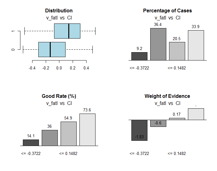
Fig.30. Connection of the ranges of the v_fatl variable with the Cl goal variable
Along with useful information, the res object contains the points of dividing the variable into ranges optimally connected with the goal variable. In our particular case there are four ranges.
> env$res$cuts
[1] -0.3722 -0.0433  0.1482
We are going to do the same calculation for the ftlm variable and plot charts:
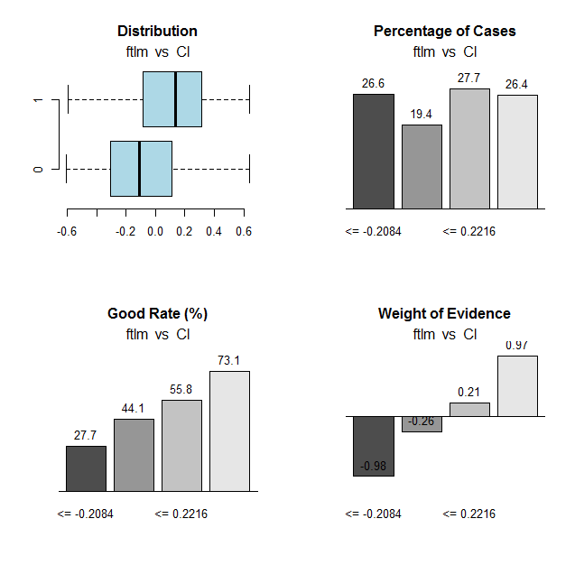
Fig.31. Connection of the ranges of the ftlm variable with the Cl goal variable
Range cutoff points:
> env$res$cuts
[1] -0.2084 -0.0150  0.2216
The cutoff points will allow us to discretize the variables in our sets and see how much the following items differ:
- important variables earlier defined using the mdlp::discretization function from the variables defined using the smbinning::smbinning; function
- splitting variables into ranges.
We already have one data set discretized with the mdlp::discretization DTd function. We are going to do the same but this time we will use the smbinning::smbinning function for the train subset only.
Define the cut points:
evalq({
  res <- list()
  DT$train %>% renamepr() %>% targ.int() -> df
  x <- colnames(df)
  y <- "Cl"
  foreach(i = 1:(ncol(df) - 1)) %do% {
    smbinning(df, y = y, x = x[i])
  } -> res
  res %>% lapply(., function(x) x[1] %>% is.list) %>%
    unlist -> idx
}, env)
Discretize the DT$train: subset
evalq({
  DT1.d <- list()
  DT$train %>% renamepr() %>%
    targ.int() %>% select(-Cl) -> train
  foreach(i = 1:length(idx), .combine = 'cbind') %do% {
    if (idx[i]) {
      findInterval(train[ ,i],
                   vec = res[[i]]$cuts,
                   rightmost.closed = FALSE,
                   all.inside = F,
                   left.open = F)
    }
  } %>% as.data.frame() %>% add(1) %>%
    cbind(., DT$train$Class) -> DT1.d$train
  colnames(DT1.d$train) <- colnames(train)[idx] %>%
    c(., 'Class')
},
env)
Identify the best variables with the importance greater than 0.1 in increasing order:
evalq({
  DT$train %>% renamepr() %>% targ.int() -> df
  sumivt.dt1.d = smbinning.sumiv(df = df, y = 'Cl')
  sumivt.dt1.d$Char[sumivt.dt1.d$IV > 0.1] %>%
    na.omit %>% as.character() -> best.dt1.d
  rm(df)
},
env)
Plot a chart of splitting variables in the DTd$train: set
require(funModeling)
plot_num(env$DTd$train)
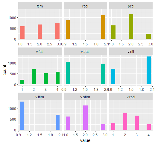
Fig.32. Variables of the DT$ train set discretized with the mdlp function
The chart of the DT1.d set with all variables and with the best ones is shown below.
plot_num(env$DT1.d$train)
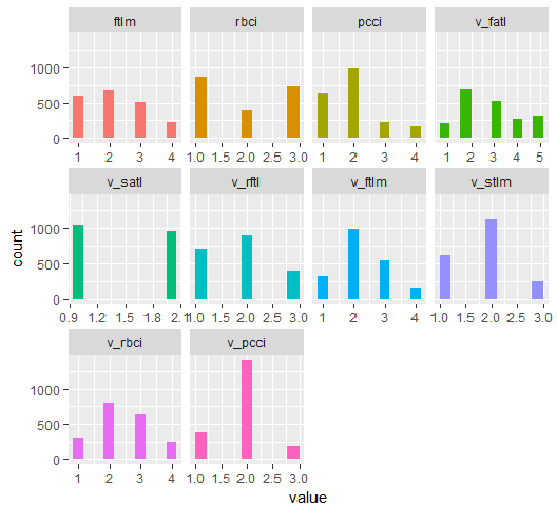
Fig.33. Variables of the DT1 d$train set discretized with the smbinning function
plot_num(env$DT1.d$train[ ,env$best.dt1.d])
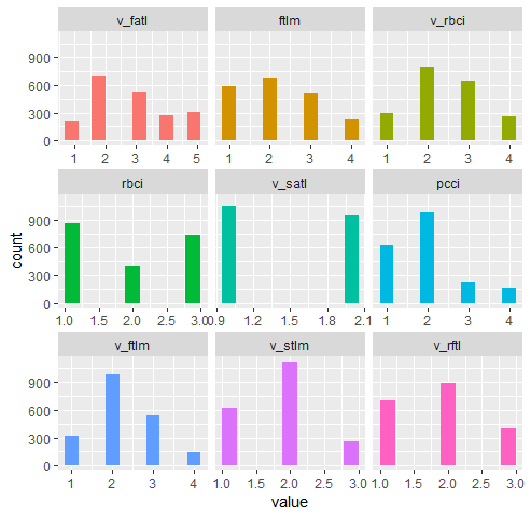
Fig.34. Variables of the DT1.d$train set discretized with the smbinning function (the best are arranged in increasing order of information importance)
What can we see on the charts? Variables defined as important are the same in both cases but splitting into ranges differs. It has to be tested which variant gives better prediction on the model.
2.2. Analytical evaluation
There are many analytical methods to identify the importance of predictors by various criteria. We considered some of them earlier. Now, I would like to test an unusual approach to the choice of predictors.
We are going to use the varbvs package. In the varbvs function implemented are: fast algorithms for installing Bayesian models of choosing variables and calculating Bayesian coefficients where the result (or goal variable) are modeled with linear regression or logistical regression. These algorithms are based on the variational approximations described in "Scalable variational inference for Bayesian variable selection in regression, and its accuracy in genetic association studies" (P. Carbonetto and M. Stephens, Bayesian Analysis 7, 2012, pages 73-108). This software was used for work with large data sets with more than a million variables and with thousands of samples.
The varbvs() function receives a matrix and the goal variable receives a numeric vector (0, 1) as input data. Using this method, let us test which predictors will be defined as important in our set with normalized data DTTanh.n$train .
require(varbvs)
evalq({
  train <- DTTanh.n$train %>% targ.int() %>%  as.matrix()
  fit <- varbvs(X = train[ ,-ncol(train)] ,
                Z = NULL,
                y = train[ ,ncol(train)] %>% as.vector(),
                "binomial",
                logodds = seq(-2,-0.5,0.1),
                optimize.eta = T,
                initialize.params = T,
                verbose = T, nr = 100
                )
  print(summary(fit))
}, env)

Welcome to           --       *                              *
VARBVS version 2.0.3 --       |              |               |
large-scale Bayesian --       ||           | |    |          || |     |   |
variable selection   -- |     || | |    |  | ||  ||        |||| ||    |   ||
****************************************************************************
Copyright (C) 2012-2017 Peter Carbonetto.
See http://www.gnu.org/licenses/gpl.html for the full license.
Fitting variational approximation for Bayesian variable selection model.
family:     binomial   num. hyperparameter settings: 16
samples:    2000       convergence tolerance         1.0e-04
variables:  12         iid variable selection prior: yes
covariates: 0          fit prior var. of coefs (sa): yes
intercept:  yes        fit approx. factors (eta):    yes
Finding best initialization for 16 combinations of hyperparameters.
-iteration-   variational    max.   incl variance params
outer inner   lower bound  change   vars   sigma      sa
 0016 00018 -1.204193e+03 6.1e-05 0003.3      NA 3.3e+00
Computing marginal likelihood for 16 combinations of hyperparameters.
-iteration-   variational    max.   incl variance params
outer inner   lower bound  change   vars   sigma      sa
 0016 00002 -1.204193e+03 3.2e-05 0003.3      NA 3.3e+00
Summary of fitted Bayesian variable selection model:
family:     binomial   num. hyperparameter settings: 16
samples:    2000       iid variable selection prior: yes
variables:  12         fit prior var. of coefs (sa): yes
covariates: 1          fit approx. factors (eta):    yes
maximum log-likelihood lower bound: -1204.1931
Hyperparameters:
        estimate Pr>0.95             candidate values
sa          3.49 [3.25,3.6]          NA--NA
logodds    -0.75 [-1.30,-0.50]       (-2.00)--(-0.50)
Selected variables by probability cutoff:
>0.10 >0.25 >0.50 >0.75 >0.90 >0.95
    3     3     3     3     3     3
Top 5 variables by inclusion probability:
  index variable   prob PVE coef*  Pr(coef.>0.95)
1     1     ftlm 1.0000  NA 2.442 [+2.104,+2.900]
2     4     pcci 1.0000  NA 2.088 [+1.763,+2.391]
3     3     rbci 0.9558  NA 0.709 [+0.369,+1.051]
4    10   v.stlm 0.0356  NA 0.197 [-0.137,+0.529]
5     6   v.satl 0.0325  NA 0.185 [-0.136,+0.501]
*See help(varbvs) about interpreting coefficients in logistic regression.
As you can see, five best predictors have been identified (ftlm, pcci, rbci, v.stlm, v.satl). They are in the top ten, which we identified earlier but in a different order and with other importance weights. Since we already have a model, let us check what result we will get on the validation and test sets.
Validation set:
#-----------------
evalq({
  val <- DTTanh.n$val %>% targ.int() %>%
    as.matrix()
  y = val[ ,ncol(val)] %>% as.vector()
  pr <- predict(fit, X = val[ ,-ncol(val)] ,
                Z = NULL)

}, env)
cm.val <- confusionMatrix(table(env$y, env$pr))
> cm.val
Confusion Matrix and Statistics


      0   1
  0 347 204
  1 137 312

               Accuracy : 0.659
                 95% CI : (0.6287, 0.6884)
    No Information Rate : 0.516
    P-Value [Acc > NIR] : < 2.2e-16

                  Kappa : 0.3202
 Mcnemar's Test P-Value : 0.0003514

            Sensitivity : 0.7169
            Specificity : 0.6047
         Pos Pred Value : 0.6298
         Neg Pred Value : 0.6949
             Prevalence : 0.4840
         Detection Rate : 0.3470
   Detection Prevalence : 0.5510
      Balanced Accuracy : 0.6608

       'Positive' Class : 0
The result does not look impressive at all. Test set:
evalq({
  test <- DTTanh.n$test %>% targ.int() %>%
    as.matrix()
  y = test[ ,ncol(test)] %>% as.vector()
  pr <- predict(fit, X = test[ ,-ncol(test)] ,
                Z = NULL)

}, env)
cm.test <- confusionMatrix(table(env$y, env$pr))
> cm.test
Confusion Matrix and Statistics


      0   1
  0 270 140
  1 186 404

               Accuracy : 0.674
                 95% CI : (0.644, 0.703)
    No Information Rate : 0.544
    P-Value [Acc > NIR] : < 2e-16

                  Kappa : 0.3375
 Mcnemar's Test P-Value : 0.01269

            Sensitivity : 0.5921
            Specificity : 0.7426
         Pos Pred Value : 0.6585
         Neg Pred Value : 0.6847
             Prevalence : 0.4560
         Detection Rate : 0.2700
   Detection Prevalence : 0.4100
      Balanced Accuracy : 0.6674

       'Positive' Class : 0
The result is nearly the same. This means that the model was not retrained and generalizes data well.
So, according to varbvs, the best are ftlm, pcci, rbci, v.stlm, v.satl.
2.3. Neural network
As we are studying neural networks, let us test which predictors the neural network will select as the most important ones.
We are going to use the FCNN4R package which provides the interface for the core programs from the FCNN C ++ library. FCNN is based on a completely new representation of the neural network which implies efficiency, modularity and expandability. FCNN4R enables standard learning (backpropagation, Rprop, simulated annealing, stochastic gradient) and algorithms of pruning (minimum magnitude, Optimal Brain Surgeon) though I see this package as an efficient calculation engine above all.
Users can easily implement their algorithm using quick gradient methods along with functionality of restoring the network (removing weights and excessive neurons, rearranging input data and uniting networks).
Networks can be exported to the C functions to be able to be integrated into any program solution.
Create a fully connected network with two hidden layers. The number of neurons in each layer: input = 12 (number of predictors), output = 1. Initiate neurons by random weight in the range +/- 0.17. Set activation functions in each layer of the neural network (except the input one) = c("tanh", "tanh", "sigmoid"). Prepare the train/val/test sets.
The script below carries out this sequence of actions.
require(FCNN4R)
evalq({
mlp_net(layers = c(12, 8, 5, 1), name = "n.tanh") %>%
  mlp_rnd_weights(a = 0.17) %>%
  mlp_set_activation(layer = c(2, 3, 4),
  activation = c("tanh", "tanh", "sigmoid"), #"threshold", "sym_threshold",
                                            #"linear", "sigmoid", "sym_sigmoid",
                                            #"tanh", "sigmoid_approx",
                                            #"sym_sigmoid_approx"),
                 slope = 0) -> Ntanh #show()
#-------
train <- DTTanh.n$train %>% targ.int() %>% as.matrix()
test <- DTTanh.n$test %>% targ.int() %>%  as.matrix()
val <- DTTanh.n$val %>% targ.int() %>% as.matrix()
}, env)
We are going to use the rprop training method. Set the constants: tol — the error when the training must be stopped if this level is reached, max_ep — the number of epochs after which the training must be stopped, l2reg — regularization coefficient. Train the network with these parameters and assess visually what network and the training error we have.
evalq({
  tol <- 1e-1
  max_ep = 1000
  l2reg = 0.0001
net_rp <- mlp_teach_rprop(Ntanh,
                          input = train[ ,-ncol(train)],
                          output = train[ ,ncol(train)] %>% as.matrix(),
                          tol_level = tol,
                          max_epochs = max_ep,
                          l2reg = l2reg,
                          u = 1.2, d = 0.5,
                          gmax = 50, gmin = 1e-06,
                          report_freq = 100)
}, env)
plot(env$net_rp$mse, t = "l",
     main = paste0("max_epochs =", env$max_ep, " l2reg = ", env$l2reg))
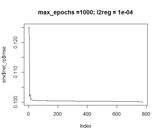
Fig.35. Error in neural network training
evalq(mlp_plot(net_rp$net, FALSE), envir = env)
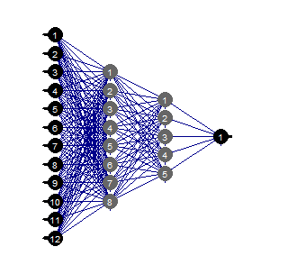
Fig.36. Structure of the neural network
Prune
Pruning of the minimal value is a simple to use algorithm. Here, the weights with the smallest absolute value are switched off at each step. This algorithm requires the network relay nearly at each step and gives suboptimal results.
evalq({
  tol <- 1e-1
  max_ep = 1000
  l2reg = 0.0001
  mlp_prune_mag(net_rp$net,
                input = train[ ,-ncol(train)],
                output = train[ ,ncol(train)] %>% as.matrix(),
                tol_level = tol,
                max_reteach_epochs = max_ep,
                report = FALSE,
                plots = TRUE) -> net_rp_prune

}, env)
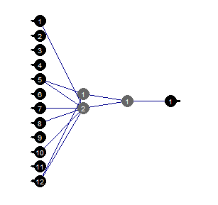
Fig.37. Pruned neural network
We can see that with a certain structure of the neural network, initial setup, activation functions and learning error, the neural network with the structure (12, 2, 1, 1) is sufficient. Which predictors were chosen by the neural network?
evalq(
  best <- train %>% tbl_df %>%  select(c(1,5,7,8,10,12)) %>% colnames(),
           env)
env$best
[1] "ftlm"   "v.fatl" "v.rftl" "v.rstl" "v.stlm"
[6] "v.pcci"
The v.rstl and v.pcci variables are not present among the best nine variables defined earlier.
I would like to stress that here we showed that a neural network can independently and automatically select important predictors. This choice depends not only on the predictors but the structure and parameters of the network.
Happy experimenting!
Conclusion
In the following part we will speak about ways to delete noise examples from the set, how to decrease the size of inputs and what effect this will have along with ways to divide original data into train/val/test.
Application
1. You can download the FeatureTransformation.R, FeatureSelect.R, FeatureSelect_analitic.R FeatureSelect_NN.R scripts and the diagrams showing the work of scripts of Part_1 of this article RData from Git /Part_II.
Translated from Russian by MetaQuotes Ltd.
Original article: https://www.mql5.com/ru/articles/3507
 Creating and testing custom symbols in MetaTrader 5
- Free trading apps
- Over 8,000 signals for copying
- Economic news for exploring financial markets
You agree to website policy and terms of use
