Creating a Trading Administrator Panel in MQL5 (Part X): External resource-based interface
Contents:
Introduction
Now, I am certain that finding a starting point is always challenging. Yet, once you have created an initial draft, it becomes easier to build on it and discover new possibilities. Many successful designers and developers begin with simple sketches and evolve their work until it becomes truly eye-catching. Even when you believe you have reached the ultimate version of your product, there is always room for further enhancement. Evolution is a continuous process, and every new iteration must bring something unique compared to its predecessor.
In this development series, we started with a monolithic Admin Panel Program featuring multiple interfaces. When the code became too long and unwieldy to maintain, we introduced better code organization by leveraging the MQL5 standard library, class inheritance, and custom header files. This approach allowed us to focus on individual aspects of the program without affecting other parts, significantly reducing the chance of errors and making future expansion possible—only limited by the developer’s imagination. Today, we are beginning a new cycle, starting from the home panel.
In my opinion, symbols are one of the most effective forms of visual communication, capable of delivering detailed information instantly and with minimal space. Throughout history, symbols have played a vital role in human communication—long before the invention of written language, early civilizations used pictographs and glyphs to represent ideas, emotions, and instructions. From ancient Egyptian hieroglyphs to modern-day emojis, symbols have remained a universal visual shorthand that transcends language barriers.
In the digital world, this tradition continues. Take, for example, the Wingdings font—a collection of symbols embedded in text that convey meaning without the need for words. In MQL5 development, symbols like these are incredibly useful, as they are well-documented and easy to implement. Their use can significantly reduce the number of visual objects displayed on a chart while still conveying essential information with clarity and elegance. A "Buy" signal, for instance, can be represented by a simple upward arrow instead of a full-text label, saving both screen space and processing power.
My focus here is on the design and management of interface areas. By incorporating symbolic elements, we can minimize clutter and maximize usability. Wingdings are one tool, but I also want to highlight the use of custom bitmap images. These can replace large buttons while maintaining functionality, offering a sleek and efficient alternative that keeps the interface clean and engaging.
Although the New_Admin_Panel home interface has already given me the satisfaction of functional success, its visual appeal still leaves room for improvement. Now that the foundational structure is in place, it's time to refine and enhance the interface design. In the next section, I’ll provide an overview of today’s development goals and how we plan to move forward with this evolution.
Discussion Overview
Today’s goal is focused on the main interface, where we will redesign and organize elements to create a more compact and visually efficient panel. We’ll begin by outlining the conceptual design of the new home interface and its components, and then proceed to implement it using MQL5—where we’ll integrate new resources and compile the improved version of the Admin Panel. A reference image is included below to help visualize the direction we’re taking.
Earlier, I mentioned Wingdings as a great example of symbolic communication—offering visual cues that convey meaning quickly and simply. While they serve as an ideal reference for minimalistic icons, I’m not planning to use them directly. Instead, I’m considering custom-designed bitmap images that will better match the aesthetic and functional goals of our new interface. Tools like GIMP, an open-source image editor, are excellent for creating these tailored graphics.
Once the custom images are ready, we’ll move on to coding their functionality and integrating them with features of the existing program. These visual assets will allow us to replace bulky buttons with lightweight icons, helping reduce visual clutter while maintaining full functionality.
As part of this development cycle, we’ll also temporarily disable user authentication to streamline testing and avoid constant login prompts. While security is not strictly required for the panel at this stage, it becomes important if the tool is to be used in environments where unauthorized access could compromise sensitive operations. Although earlier implementations used hard-coded values for key encryption, developers are encouraged to take that extra step toward secure access management if needed.
This session will guide you through working with custom visual resources in MQL5, from concept to implementation. By the end, we aim to produce a refined, responsive, and scalable interface that not only functions well but looks clean and modern.

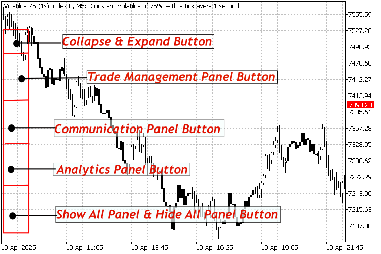
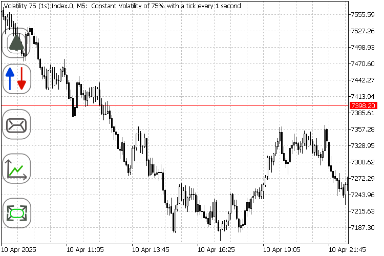
New minimized home interface sketch (56px by400px)
Conceptual Design
With that concept in mind—and having not found any satisfactory symbol options among the available resources—I decided to create my own, leveraging open-source tools for flexibility and customization. I used Inkscape to quickly lay out my designs, as it is one of the most powerful and efficient vector graphic editors available. However, Inkscape does have limitations when it comes to exporting certain file formats.
To overcome this, I used GIMP to further refine the images and export them in the desired bitmap format suitable for MQL5 integration. Below, you'll find the conceptual layout of the interface. After reviewing the design, we’ll break down the function of each button, and then move on to the implementation phase in code.

Conceptual layout of the AdminHome interface
Description of Home Buttons and their functions
Collapse and Expand Button:
This button has two states: one for expanding, which makes all the interface buttons visible, and the other for collapsing, which hides all the buttons from view.
 Expand
 Collapse
Trade Management Panel Button:
We used two arrow icons to visually represent the concepts of buying and selling. This makes it easier for the user to intuitively understand the purpose of the button at a glance.
 Trade Management Panel Button
 Trade Management Panel Button Pressed
Communications Panel Buttons:
For this button, I designed an envelope symbol to represent the concept of communications. This familiar icon makes it easy for users to quickly recognize its purpose and understand its function at a glance.
 Communications Panel Button
 Communication Panel Button Pressed
Analytics Panel Button:
This button, featuring a graph symbol, effectively conveys the idea of analysis. Since charts are essential tools in performing market analysis, the icon instantly signals its purpose to the user.
 Analytics Panel Button
 Analytics Panel Button Pressed
Show all and hide all panels button:
This button serves as a convenient shortcut to instantly expand or collapse all panels. Its design features diverging arrows, symbolizing an expanded or broad view, which visually communicates its function to the user.
 Show/Hide All Button
 Show/Hide All Button Pressed
Tip:
To get the images working correctly in MetaTrader 5, I had to export them in BMP format using GIMP, specifically with a 24-bits setting. Any other format, failed to display properly in the terminal. The images shown above are in PNG format for illustration purposes only. You will find the actual BMP files included in the attached folder at the end of this article.
Code Implementation
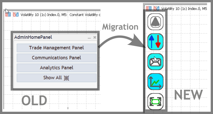
Now we begin working with our MQL5 code to bring the concept described above to life. This marks a transformation of the interface—from the previous structure to a more refined and imaginative design—as we continue enhancing and evolving our administrative panel. By the end, we will produce a new home interface as portrayed in the image below.

The migration from the old home interface to a new external resource-based interface
As mentioned earlier, we are temporarily disabling the authentication feature to avoid interruptions from prompts during testing. Importantly, this doesn’t mean removing the authentication logic altogether. Instead, we’re simply commenting out the related code. Remember, comments in code are not executed; they exist to help developers communicate and explain logic in plain language.
In this step, we’ll also demonstrate how the custom images we prepared will be used as resources, displayed as floating buttons on the main interface. This represents a shift away from using the Dialog class for the Home Panel interface. The new design is simplified and more minimalistic.
Let’s now break down the structure of our main program.
1. Overview
In this section, we aim to transform a basic admin panel into a modern, floating interface using BMP image buttons. The goal is to create an interface where buttons—displayed as images—change state (for example, between "expand" and "collapse"), providing a visually appealing and interactive design. These buttons float above other chart elements such as candlesticks, ensuring smooth user interaction.
We included external modules for authentication (along with communications, Telegram, dialog controls, trade management, and analytics), even though the authentication logic itself is currently disabled by commenting it out. This decision is temporary since the functionality is still in progress, and it enables us to focus on developing and testing the floating button interface without password prompts. We can re-enable the authentication code with minimal adjustments later, allowing for a seamless transition to a fully secure system.
//+------------------------------------------------------------------+
//|                                               New_Admin_Panel.mq5|
//|                                Copyright 2024, Clemence Benjamin |
//|             https://www.mql5.com/en/users/billionaire2024/seller |
//+------------------------------------------------------------------+
#property copyright "Copyright 2024, Clemence Benjamin"
#property link      "https://www.mql5.com/en/users/billionaire2024/seller"
#property version   "1.00"

// Authentication inputs (unused; authentication disabled).
input string AuthPassword = "2024";
input string TwoFactorChatID = "YOUR_CHAT_ID";
input string TwoFactorBotToken = "YOUR_BOT_TOKEN";

#include <Authentication.mqh>
#include <CommunicationsDialog.mqh>
#include <Telegram.mqh>
#include <Controls\Dialog.mqh>
#include <TradeManagementPanel.mqh>
#include <AnalyticsPanel.mqh>
2. File Resources in MQL5
MQL5 allows embedding external files—such as images and sounds—directly into the program using resource directives. This project uses BMP image files as resources for creating custom buttons. By embedding these image files with resource statements, the images are packaged with the executable, ensuring they are always available when the program runs. This technique is critical for building a reliable and portable interface, as it guarantees consistent access to the necessary visual assets regardless of the external file system.
#resource "\\Images\\expand.bmp"
#resource "\\Images\\collapse.bmp"
#resource "\\Images\\TradeManagementPanelButton.bmp"
#resource "\\Images\\TradeManagementPanelButtonPressed.bmp"
#resource "\\Images\\CommunicationPanelButton.bmp"
#resource "\\Images\\CommunicationPanelButtonPressed.bmp"
#resource "\\Images\\AnalyticsPanelButton.bmp"
#resource "\\Images\\AnalyticsPanelButtonPressed.bmp"
#resource "\\Images\\ShowAllHideAllButton.bmp"
#resource "\\Images\\ShowAllHideAllButtonPressed.bmp"
3. Interface Creation and Button Design
The interface is built using "bitmap label" objects that display BMP images. Each button in the interface is represented by one of these image objects, and their positions on the chart are defined by pre-determined coordinates. A high Z-order value is assigned to these objects so they render on top of other chart elements, making them highly responsive to user clicks. This setup ensures that the floating buttons are not only visually appealing but also functionally robust.
// Button names
string toggleButtonName    = "ToggleButton";
string tradeButtonName     = "TradeButton";
string commButtonName      = "CommButton";
string analyticsButtonName = "AnalyticsButton";
string showAllButtonName   = "ShowAllButton";

// Button original positions
const int BUTTON_TOGGLE_X    = 10;
const int BUTTON_TOGGLE_Y    = 30;
const int BUTTON_TRADE_X     = 10;
const int BUTTON_TRADE_Y     = 100;
const int BUTTON_COMM_X      = 10;
const int BUTTON_COMM_Y      = 170;
const int BUTTON_ANALYTICS_X = 10;
const int BUTTON_ANALYTICS_Y = 240;
const int BUTTON_SHOWALL_X   = 10;
const int BUTTON_SHOWALL_Y   = 310;
4. Button Hiding and Showing Technique
Helper functions are used to move the buttons to a specific off-screen coordinate, simulating a collapse effect. When the interface is expanded, another set of helper functions restores the buttons to their original on-screen positions. This technique is both efficient and responsive for managing the visibility of the user interface elements.
// Off-screen coordinate for hiding buttons
const int HIDDEN_X = -50;

// Hide a button by moving it off-screen.
void HideButton(string buttonName)
{
   ObjectSetInteger(0, buttonName, OBJPROP_XDISTANCE, HIDDEN_X);
}

// Restore a button to its original position.
void ShowButton(string buttonName, int X, int Y)
{
   ObjectSetInteger(0, buttonName, OBJPROP_XDISTANCE, X);
   ObjectSetInteger(0, buttonName, OBJPROP_YDISTANCE, Y);
}
5. Handling Sub-Panel Interactions
Each button on the interface is linked to a sub-panel (such as trade management, communications, or analytics). When a button is clicked, its associated sub-panel is either created if it does not exist or toggled between visible and hidden states. This on-demand creation minimizes resource usage and keeps the interface uncluttered. Each sub-panel is managed independently, allowing the user to work with one section at a time while still being able to access others when needed.
// Handle the Communications Panel button.
void HandleCommunications()
{
   if(g_commPanel != NULL && g_commPanel.IsVisible())
   {
      g_commPanel.Hide();
      ChartRedraw();
      return;
   }
   if(g_commPanel == NULL)
   {
      g_commPanel = new CCommunicationDialog(TwoFactorChatID, TwoFactorBotToken);
      if(!g_commPanel.Create(g_chart_id, "CommPanel", g_subwin, 80, 100, 380, 300))
      {
         delete g_commPanel;
         g_commPanel = NULL;
         return;
      }
      ObjectSetInteger(0, "CommPanel", OBJPROP_ZORDER, 10);
   }
   g_commPanel.Toggle();
   ChartRedraw();
}

// Handle the Trade Management Panel button.
void HandleTradeManagement()
{
   if(g_tradePanel != NULL && g_tradePanel.IsVisible())
   {
      g_tradePanel.Hide();
      ChartRedraw();
      return;
   }
   if(g_tradePanel == NULL)
   {
      g_tradePanel = new CTradeManagementPanel();
      if(!g_tradePanel.Create(g_chart_id, "TradeManagementPanel", g_subwin, 390, 20, 900, 530))
      {
         delete g_tradePanel;
         g_tradePanel = NULL;
         return;
      }
      ObjectSetInteger(0, "TradeManagementPanel", OBJPROP_ZORDER, 10);
   }
   g_tradePanel.Toggle();
   ChartRedraw();
}

// Handle the Analytics Panel button.
void HandleAnalytics()
{
   if(g_analyticsPanel != NULL && g_analyticsPanel.IsVisible())
   {
      g_analyticsPanel.Hide();
      ChartRedraw();
      return;
   }
   if(g_analyticsPanel == NULL)
   {
      g_analyticsPanel = new CAnalyticsPanel();
      if(!g_analyticsPanel.CreatePanel(g_chart_id, "AnalyticsPanel", g_subwin, 980, 20, 1480, 480))
      {
         delete g_analyticsPanel;
         g_analyticsPanel = NULL;
         return;
      }
      ObjectSetInteger(0, "AnalyticsPanel", OBJPROP_ZORDER, 10);
   }
   g_analyticsPanel.Toggle();
   ChartRedraw();
}
6. Encapsulation of Toggle/Collapse-Expand Logic
To streamline the user interface management, the collapse and expansion logic is encapsulated in a single function. This function reads the current state of the main toggle button, flips its state, and then either hides or restores the positions of the other buttons. Encapsulating this logic in one function avoids redundancy in the event handling code and makes the overall design cleaner and easier to maintain.
// Toggle collapse/expand of interface buttons.
void ToggleInterface()
{
   // Toggle the state of the toggle button.
   bool currentState = ObjectGetInteger(0, toggleButtonName, OBJPROP_STATE);
   bool newState = !currentState;
   ObjectSetInteger(0, toggleButtonName, OBJPROP_STATE, newState);

   if(newState)
      UpdateButtonVisibility(false);  // Collapse: hide buttons and minimize sub-panels.
   else
      UpdateButtonVisibility(true);   // Expand: restore button positions.

   ChartRedraw();
}
7. Program Initialization
Thorough testing is essential to ensure that the interface behaves as expected. The initialization function sets up the buttons and guarantees that they are visible from the start. During testing, one should verify that the buttons remain responsive, that the sub-panels toggle correctly, and that the buttons always appear above chart elements, thanks to the high Z-order values. Additionally, while authentication is currently disabled, the related code is included as comments, making it easy to re-enable access restrictions when needed. Future enhancements could include integrating sounds or animations to further enrich the user experience.
// Expert initialization function
int OnInit()
{
   g_chart_id = ChartID();
   g_subwin   = 0;

   // For potential future use, authentication can be re-enabled by uncommenting these:
   // if(!g_authManager.Initialize())
   //    return INIT_FAILED;

   // Create main toggle and sub-panel buttons using their original positions.
   CreateObjectBITMAP_LABEL(toggleButtonName, BUTTON_TOGGLE_X, BUTTON_TOGGLE_Y, "::Images\\expand.bmp", "::Images\\collapse.bmp");
   CreateObjectBITMAP_LABEL(tradeButtonName, BUTTON_TRADE_X, BUTTON_TRADE_Y, "::Images\\TradeManagementPanelButtonPressed.bmp", "::Images\\TradeManagementPanelButton.bmp");
   CreateObjectBITMAP_LABEL(commButtonName, BUTTON_COMM_X, BUTTON_COMM_Y, "::Images\\CommunicationPanelButtonPressed.bmp", "::Images\\CommunicationPanelButton.bmp");
   CreateObjectBITMAP_LABEL(analyticsButtonName, BUTTON_ANALYTICS_X, BUTTON_ANALYTICS_Y, "::Images\\AnalyticsPanelButtonPressed.bmp", "::Images\\AnalyticsPanelButton.bmp");
   CreateObjectBITMAP_LABEL(showAllButtonName, BUTTON_SHOWALL_X, BUTTON_SHOWALL_Y, "::Images\\ShowAllHideAllButtonPressed.bmp", "::Images\\ShowAllHideAllButton.bmp");

   // Always show the interface initially.
   UpdateButtonVisibility(true);
   ChartRedraw();
   return INIT_SUCCEEDED;
}

// Expert deinitialization function
void OnDeinit(const int reason)
{
   ObjectDelete(0, toggleButtonName);
   ObjectDelete(0, tradeButtonName);
   ObjectDelete(0, commButtonName);
   ObjectDelete(0, analyticsButtonName);
   ObjectDelete(0, showAllButtonName);

   if(g_commPanel != NULL)
   {
      g_commPanel.Destroy(reason);
      delete g_commPanel;
      g_commPanel = NULL;
   }
   if(g_tradePanel != NULL)
   {
      g_tradePanel.Destroy(reason);
      delete g_tradePanel;
      g_tradePanel = NULL;
   }
   if(g_analyticsPanel != NULL)
   {
      g_analyticsPanel.Destroy(reason);
      delete g_analyticsPanel;
      g_analyticsPanel = NULL;
   }
}
Testing
As usual in MetaTrader 5, you can launch your program by simply dragging it from the Expert Advisors list onto a chart. To ensure smooth compilation and execution, it's essential that all external modules are properly placed in their respective folders, and that all required resources—such as images—are correctly organized.
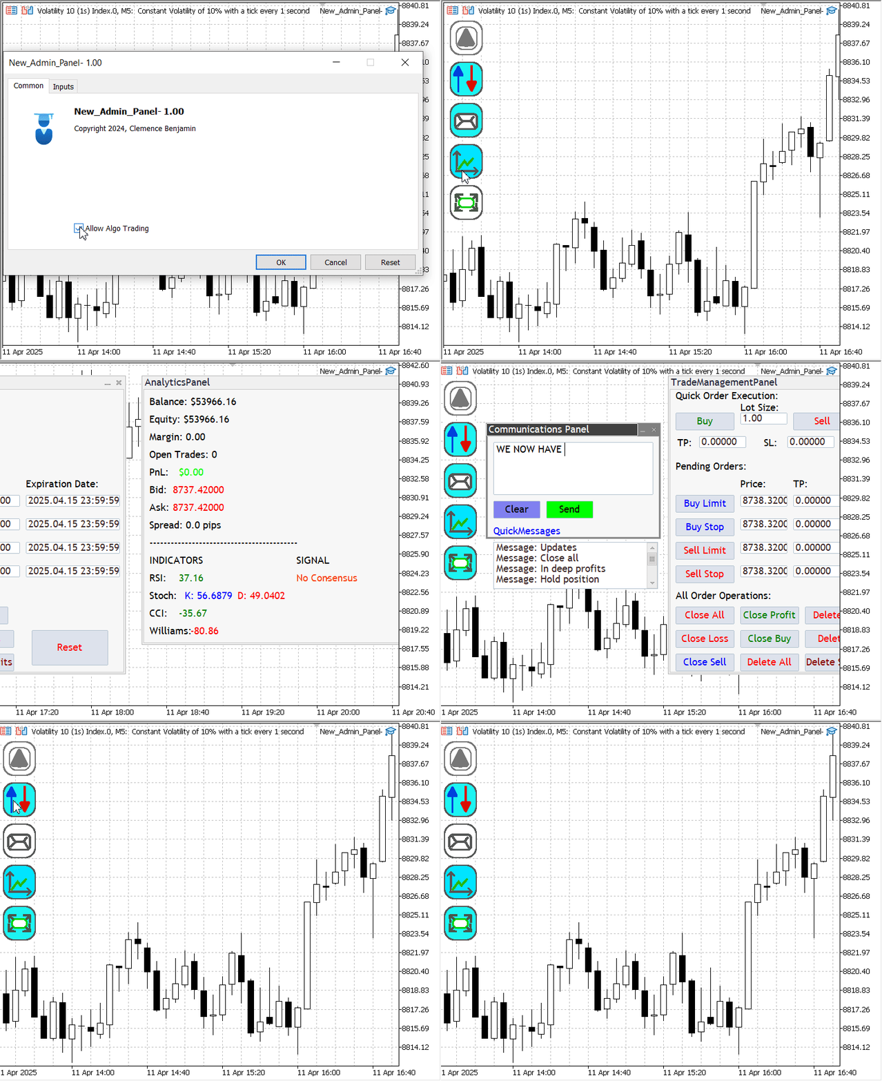
Below, I’ve included an image showcasing the outcome of our redesigned interface. From these visuals, you can get a clear sense of the direction we’re heading and identify areas where further enhancements can be made.

Testing the New_Admin_Home Interface
Tip:
When using the new button for the first time after adding the program to the chart, the initial click initializes the corresponding panel, but the panel does not appear immediately. It becomes visible only after the second click.
Conclusion
Today, we explored how to leverage external resources effectively to build a powerful and customizable user interface in MQL5. In this project, we evolved from a basic home interface into a more dynamic and visually appealing floating panel system—retaining core functionality while introducing new features for improved usability and accessibility.
One of the key takeaways is how this development enhances our understanding of MQL5’s capabilities, particularly regarding graphical resources like BMP images. The floating button design offers centralized access to admin panel features while keeping the chart uncluttered, preserving more visible chart space (pixels) for trading insights.
It’s worth noting that no solution is ever truly perfect. However, each iteration—each step forward—brings us closer to a better, more efficient version. Earlier versions still matter greatly, as they serve as reference points for innovation and improvement.
To support others in following along without issues, I’ve considered packaging today’s source code together with previous modules in a unified ZIP file. This ensures all necessary files are included, especially for those who may have skipped or missed earlier setups. Missing files often lead to compile-time errors, so this will help users get started smoothly.
A special acknowledgment goes to MetaQuotes for their informative article on using resources in MQL5, which served as a valuable reference. Implementing those ideas in a real-world project like this has been an insightful and rewarding experience.
| File Name | Specifications |
|---|---|
| New_Admin_Panel.mq5 | The new main program with a new look. |
| New_Admin_Panel_BMP images.zip | This is a folder containing all the bitmap images used. Please add these images to the MQL5\images directory to ensure they are properly loaded and displayed by the interface. |
| All Modules.zip | A folder containing all the header files used in Part (IX). Please extract these files into the include directory of your MQL5 installation to ensure proper compilation and functionality. |
 Building a Custom Market Regime Detection System in MQL5 (Part 1): Indicator
 Neural Networks in Trading: Scene-Aware Object Detection (HyperDet3D)
 MQL5 Wizard Techniques you should know (Part 60): Inference Learning (Wasserstein-VAE) with Moving Average and Stochastic Oscillator Patterns
 Developing a Replay System (Part 65): Playing the service (VI)
- Free trading apps
- Over 8,000 signals for copying
- Economic news for exploring financial markets
You agree to website policy and terms of use