Can the SB chart be distinguished from the price chart? - page 12
You are missing trading opportunities:
- Free trading apps
- Over 8,000 signals for copying
- Economic news for exploring financial markets
Registration
Log in
You agree to website policy and terms of use
If you do not have an account, please register
Nova's questions in no way hint at the colour of her knickers. However, she is wearing white...
Lieutenant...
To the heroism of the brave we sing a song...sibirqk,danminin,Vizard_ have correctly identified price and SB charts, regarding increments@Vizard_
It doesn't tell you anything. No one will be able to determine systematically.
If you conduct a study according to all the rules of statistics, i.e. give 100-200 pairs of charts, the guess will be 50/50.
To the heroism of the brave we sing a song...sibirqk,danminin,Vizard_ have correctly identified the price and SB charts, about the increments@Vizard_
there seems to be no SB at all.
the left graph is incomprehensibly generated.
there doesn't seem to be any SB at all.
the left-hand graph is incomprehensibly generated.
Not much different question, why would SB be drawn to price? What is the physical meaning to work with prices???
Historical gbpusd c 1791https://www.anaga.ru/analytcal-info/2/6.htm start value 4.5558, generate the SB of that pair from 1791g minute by minute(already a statistically significant amount) and the resulting chart will have nothing to do with price. Real quotes reflect the correlation/development/crisis/wars of countries and gbpusd for 2.5 centuries shows this very well with its extremes and final rate - these are not some random processes. And for the little and not so physics buffs a more appropriate model is Maxwell's demon(DM) with perpetual motion, the rich(hot) will stay rich and get richer at the expense of the poor(cold). The only area where DM processes are stable is economics.
These are increments, I think it's easier to visualise here, the same conundrum, if you don't get bored))
the first one has a pronounced arch effect, the market usually has a conventionally pronounced arch, i.e. there is no such stable cyclicality, and it still depends on previous values of its own
and yes, this does not mean that BP is not random until the model is built and the errors in the new data are determined
The problem is that the dependencies are constantly changing
and Dmitry correctly noted that this effect occurs due to clustering of volatility at different trading sessions, i.e. there is no other "pattern"
You can, in part, get rid of this effect by introducing volatility corrections and you will have almost pure SB
wiki
You will end up with only"Patterns" like this
Shall we continue the riddles?))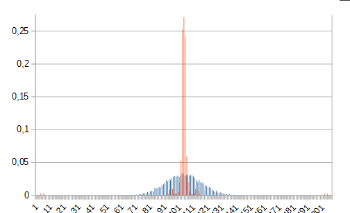 one-price-distribution, the other-sub
the next two pictures are of the top one
there doesn't seem to be any SB at all.
the left-hand graph is incomprehensibly generated.
The picture there is blurred through copy-paste, so the cycles appeared "by eye", so it would be more correct:
I wonder how they were guided? For me it is incomprehensible, the data is not enough, so different distributions, but the charts themselves..., could it be just because of that effect where the price jumped back and forth in the right picture?
P.S. The spikes were - tick:- up-100, then after two ticks down 98, and so on several times.