Currency heat map - page 11
You are missing trading opportunities:
- Free trading apps
- Over 8,000 signals for copying
- Economic news for exploring financial markets
Registration
Log in
You agree to website policy and terms of use
If you do not have an account, please register
and btw, Mladen, - super!
Very impressive indicator indeed! This is just the kind of stuff that actually helps in trading! Thanks a lot!
What is your method of deciding if a move is "strong up" "up" etc?
calculations behind the scene
Great job Malden, I was wondering on the basis of the calculation so I can further understand it to use as a trading tool.
any insight on it as well as if there are any adjustable parameters would help.
Regards,
Medi
CP6 directed me to a site with something like this on their web page, and asked if it can be made as indicator. Well, here it is (changed their approach )
PS : if you, by chance, get a display like on the lower displayed indicator, download and install the MS LineDraw font in the attachment and check "UseMSLineDraw" to true
PPS: added a version that can recognize any broker prefix or suffix (the "any" version) It needs the "allow dll imports" enabled in order to work correctlyname of right up corner indicator please?
Currency Heat Map - any
Can other time frames be added to this indicator. eg 60 minute and 15 minute.
Thanks
Blaiserboy
Simply add the time frames separated by ";" in the TimeFrames parameter, you do not need to use default time frames at all (or you can use all of them, if you feel so). Here is an example where "m15;h1;h4;d1" are entered in TimeFrames field
regardsMladen
Can other time frames be added to this indicator. eg 60 minute and 15 minute. Thanks
Ok. Great. thanks for your rapid reply..!!
M, it is possible to code a heatmap macd based?
could anybody tell me why that "heat map" looks like this. all colors are mixed together, there are no boundaries bet cells??!!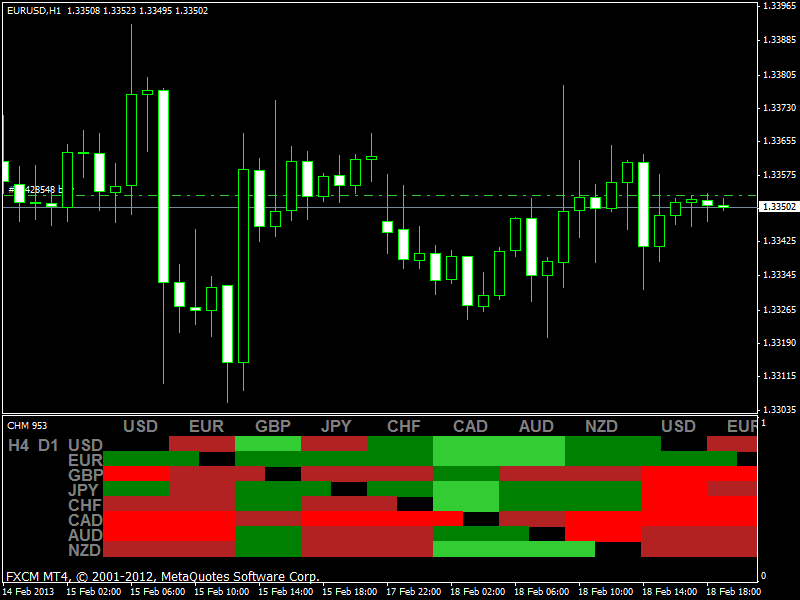
1. Did you try to change the fonts sizes in the code?
2. Did you try to install the MsLineDraw from the first post and UseMSLineDrawFont to true?
But from the picture it seems that you have case 1 and that you tried to do something like this (fonts sizes for text changed to 11 and for boxes to 13 - which exactly replicates your picture) You can not do that without changing the whole code and the positions on chart. Use the original or revert the code changes you have made and it will display OK
could anybody tell me why that "heat map" looks like this. all colors are mixed together, there are no boundaries bet cells??!!
On my terminal it is OK
could anybody tell me why that "heat map" looks like this. all colors are mixed together, there are no boundaries bet cells??!!