Price Change Distributions
- Indicateurs
- Safwan Rushdi Khalil Arekat
- Version: 1.3
- Mise à jour: 17 mars 2023
This indicator demonstrates that the price change of financial instruments is NOT a random walk process, as advocated by the "Random Walk Hypothesis", and as popularised by the bestselling book "A Random Walk Down Wall Street". I wish that were the case! It is shown here that the real situation with price change is actually much worse than a random walk process! Deceptive market psychology, and the bulls-bears tug of war, stack up the odds against traders in all instruments, and all time frames. As a trader yourself, how often have you witnessed your profits on a trade rise sharply, only to immediately vanish ? How often have you suffered from false breakouts ? How often did the dead cat not only bounce, but jump to the roof because the cat is very much alive and feisty? This indicator only scratches the surface of a very deep and involved subject. It is just the tip of a still little known iceberg. However, this indicator also suggests a way to reduce market deception forces, by transforming the price statistics. A new, more manageable price change is produced, which can be used in indicators and trend following techniques.
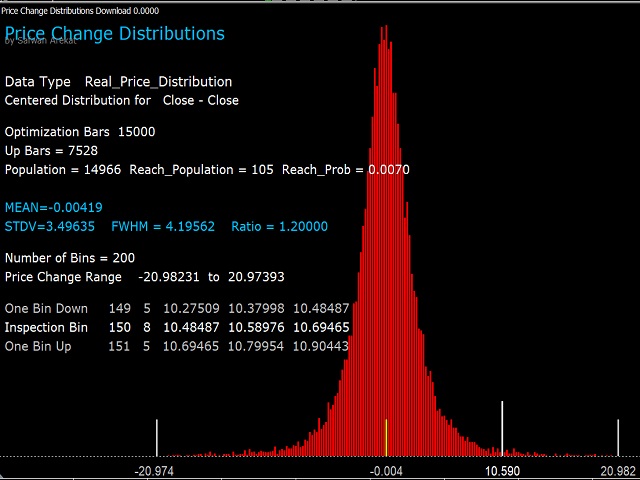
The indicator calculates and plots the price change distribution (say the change from bar-close to the next bar-close). If the price change is a random walk process, being based on an equal chance of price rising or falling, and after a very large number of steps, it would necessarily produce a normal distribution of price change (Gaussian Distribution). But this is not what I discovered independently (I thought I was the first, but other researchers did it before me).
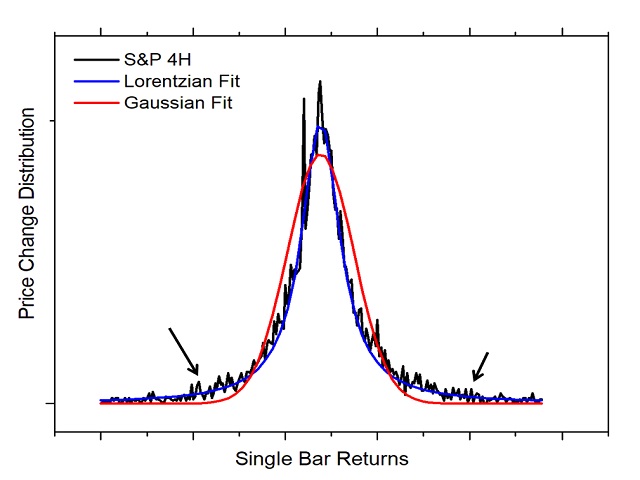
Consider screenshot 2, which is data exported from this indicator. The black distribution is the H4 close-close price distribution for the S and P. The red line is the lowest error fitting using a Gaussian distribution. But the price change is actually fit much better with a Lorentzian distribution. The details are not too important now. You will have a chance to construct and study distributions for yourself using this indicator. The point is this: there is a much larger number of long bars present than would be expected if it were a random process. Also, the width of the distribution, full width at half max (FWHM), is narrower than is expected. The ratio of FWHM to standard deviation in a Gaussian distribution should be around 2.35. Much lower ratios are seen in real price distributions.You really need a minimum background is statistics to understand what is going on here.
So what? You ask ! There are more long bars than expected, maybe that works in our favour if long bars appear successively in a trend. But this is not what happens in most cases. Although the number of up bars almost equals the number of down bars in almost all charts. Deceptive forces stack the bars such that the probability of reversal is slightly-more than the probability of continuation. This is something I discovered from another study, in another indicator, where I analysed in-a-row probabilities. But you might see this just by looking at bar charts. Try to spot the long bars in opposite directions in close proximity to each other. You should see plenty.
It is not my intention to make this description a scholarly article, I might still write one soon. But because the claim made on the logo is a big one. It needs strong evidence to support it. I believe with the proper understanding and the careful use of this indicator, you will see my point.
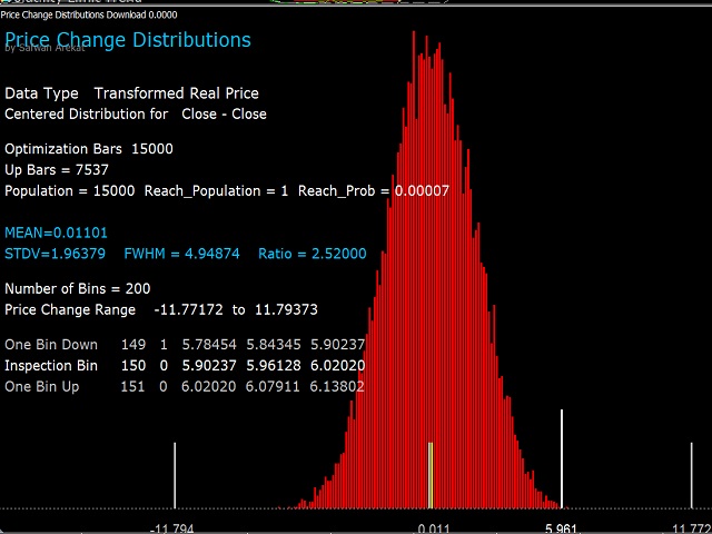
But how to overcome the deceptive forces ? Answer: Maybe by transforming the price statistics. This indicator does this. It uses a special formula to convert the distribution to a normal Gaussian distribution. The length of all price bars are changed, in a prescribed manner, to be as close as possible to their original lengths, maintaining the same trend information, but at the same time produce a new distribution. A new price time series is produced that is hopefully more manageable.
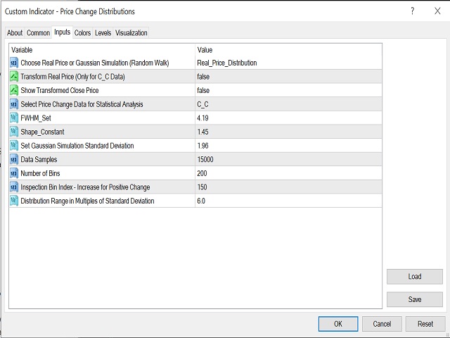
Screen shot 3 shown the indicator inputs window:
1. Choose real vs. simulation: use to select the data, either the real price on this chart and time-frame. Or simulate a fictitious Gaussian distribution of similar characteristics. (The simulated Gaussian setting is provided only for comparison - it is not necessary for the process of real price transformation).
2. Transform Real Price : use this, after the necessary settings, as described below, to transform the real price statistics and obtain a new Gaussian-like distribution.
3. Transformed Price: use this, after obtaining the transformed distribution, to produce and display the new price data.
4. Select Price Change Data: use C-C (Close-Close change).
5. FWHM set: explained below
6. Shape constant: explained below
7. Sets the simulated fictitious Gaussian distribution standard deviation (NOT the real transform price).
The rest you can study for yourself. (You need to be motivated to understand this indicator.)
How to use the indicator to produce a new more manageable Close price time series ?
a. Attach the indicator to chart.
b. By default, it should display the real price distribution and data.
c. Enter the number for FWHM from the screen into the inputs window (input 5).
d. See the resulting ratio of FWHM to STDV (standard deviation). The ratio should be 2.35, or as close to it as possible.
e. Adjust the Shape constant (normally in the range 1-3), and see if that makes the ratio better. Keep adjusting until the closest to 2.35 is obtained.
f. When ready, set transformed price (input 3) to TRUE. You should see your the new price you can work with for trends and indicators.
The inputs are set by default ready to be applied to Gold H1 charts (as of the time of writing this) . The process described needs to be applied to any other instrument or time-frame.
Screenshot 4 is the real price distribution for Gold 1H.
Screenshot 5 is the transformed distribution of the real price after applying the input Transform Real Price (input 2).
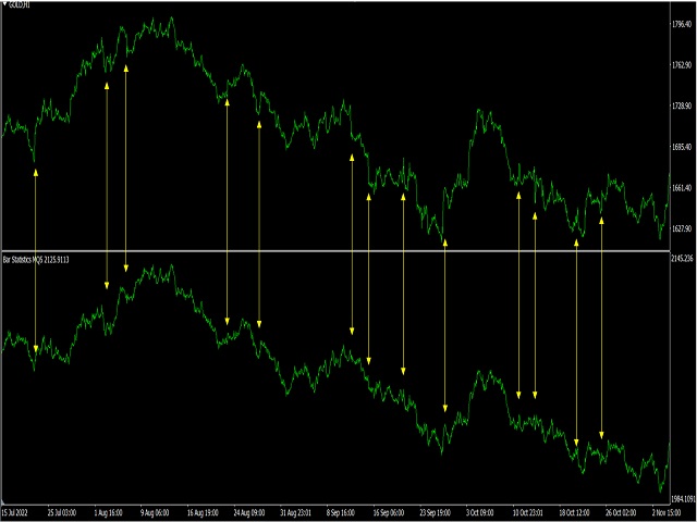
Screenshots 6 is a new price time-series after applying Transformed Price (input 3). Comparisons with the real chart price are made.
Decreasing this deceptive volatility might reduce false signals in indicators (whipsaws).
The transformed price is exportable using iCustoms.
NOW RUNS IN REAL TIME.
