

But this is just scratching the surface of what traders can do with price action analysis…
In this article, we’re going to delve deeper into the topic of supply and demand via price action. We’re going to look at how traders can identify swings and potential points of entry using price action analysis.
The Secret Messages of Price Action
Increasing demand in a market will generally be met with higher prices. It doesn’t really matter how or why that demand increased, the very act of more buyers entering the market means that sellers can command a higher price.
As prices rise, sellers are more incentivized to sell. This creates price swings in the market (notice the two red boxes inside of the larger blue box in the below chart).
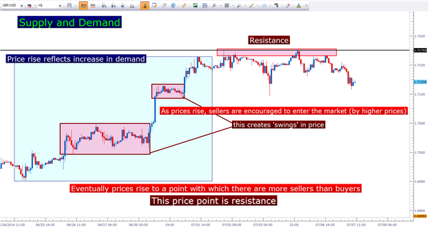
Eventually, prices rise to a level at which sellers take control of the
market… but not only are more sellers entering the market to initiate
new short positions, but buyers are more hesitant to chase these new
higher prices. This is what creates resistance in a market (noted on the
above chart with the black line at 1.7175 on GBPUSD).
This is the beauty of price action: It gives the trader an
accurate depiction of supply and demand at any one point-in-time to
offer the cleanest view of that particular market. But how can this
proactively be used in a trading approach?
The Power of the Wick
We can take these ‘messages’ via price action to the next logical step:
locating points of emphasis within a single candlestick or a series of
candlesticks to find areas of interest for potential trade entries.
Since price action can show us supply and demand, the act of a market
showing an elongated wick can highlight reversal potential. Let’s look
at an example below.
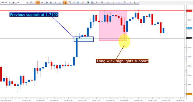
After an extended run from 1.6700, GBPUSD continued to rally to new
six-year highs. That is, until the market traded into 1.7175; at which
point sellers came in to move prices lower (indicated by the red box).
Sellers controlled the market all the way down to 1.7100, at which point
buyers came in to offer support (highlighted by the yellow circle).
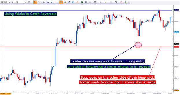
This wick highlights reversal potential. It shows traders that during this candle’s formation; prices ran all the way down to previous support of 1.7100; and then buyers came into the market to bring prices higher (which creates the wick on the bottom-side of price action).
This is evidence of buyers entering to take advantage of a ‘perceived
value’ in the market, as a previously hot-running trend is now cheap
with prices at support.
This shows traders that prices may continue running higher after this
inflection with support, and that a long entry may be possible.
Why are Wicks so Important?
Wicks are a pivotal part of price action analysis (pun intended) because
they show us potential price reversals at the very earliest stage,
while also validating support and resistance levels in the market.
Imagine this on a granular scale using the GBPUSD setup we had looked at previously.
After setting six-year highs, prices began retracing as long
position-holders closed positions to take profits off-the-table while
sellers came into attempt to trade a reversal off of 1.7175. This is
what created the retracement in the red box.
But once we get to the previously-established support level of 1.7100,
something changes… more buyers enter the market to push prices even
higher above 1.7100.
Once this hourly candle had closed, a long wick is showing on the bottom
side of price action – indicating that the retracement in GBPUSD may be
over and that price may begin moving higher.
The trader can use this to identify a defined-risk play… meaning that should prices continue moving higher; this low should hold as up-trends show higher-highs, and higher-lows. If prices don’t continue trending higher, this allows the trader to close the position quickly; before they find themselves on the wrong side of a trend.
Long wicks validate support and resistance, and allow the trader to define their risk in any entries that may be taken in the market.


 – 4H Chart | Deep Pullback into Demand – Bullish Continuation")
")