High Low Close chart with thick wicks
- Indikatoren
- Amin Alisher Shaikh
- Version: 1.0
- Aktivierungen: 5
Hinweis: Sie müssen Ihren vorhandenen Diagrammtyp ausblenden. Dies können Sie tun, indem Sie die Farben des Diagramms ändern. Wenn Sie nicht wissen, wie das geht, schauen Sie sich dieses Video an – https://youtu.be/-4H6Z5Z4fKo
oder kontaktieren Sie mich unter priceaction9@outlook.com
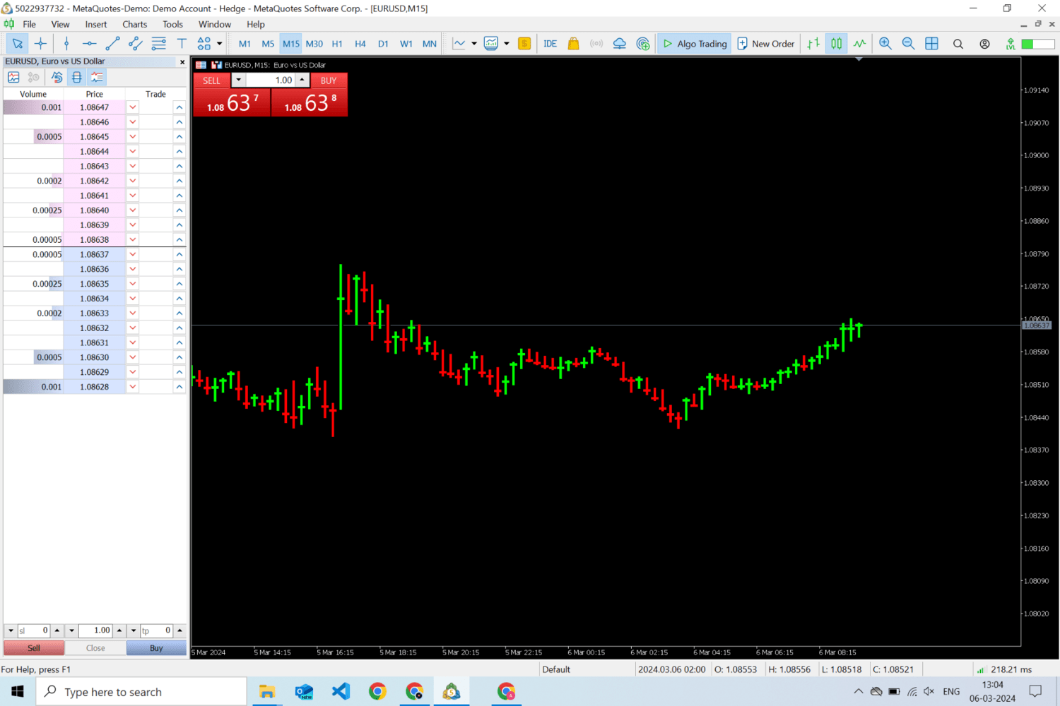
Hierbei handelt es sich um eine Art Diagramm, das anstelle Ihres Diagramms angezeigt wird. Es zeigt nur das Hoch, Tief und den Schlusskurs an und verfügt über dicke Dochte. Es hilft Ihnen, jede Kerze besser zu verstehen, indem es den Lärm reduziert, der durch die offenen Preise für jede Kerze verursacht wird.
Wenn zum Beispiel auf der Skala von 1 bis 10 die Kerze bei 5 öffnet und bei 8 schließt und ein Tief von 1 erreicht, dann bildet sie einen Körper aus 3 Punkten und hat Dochte für die restlichen Punkte, und daher ist es manchmal schwierig, sie herzustellen Sinn dafür.
Wenn in diesem Diagramm dasselbe Szenario auftritt, wird der Schlusspunkt bei 8 angezeigt. Wenn Sie ihn betrachten, erhalten Sie sofort eine Vorstellung davon, dass er von 1 auf 8 in positiver Richtung und von 10 auf 8 in negativer Richtung gestiegen ist, und daher wissen Sie, dass dies der Fall ist eine bullische Kerze.
Wenn Sie Fragen haben, lassen Sie es mich hier wissen: priceaction9@outlook.com