Price Distance from Moving Average
- 지표
- Eduardo Fernando Teixeira
- 버전: 1.5
- 활성화: 5
Moving Average Distance Indicator
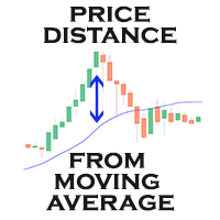
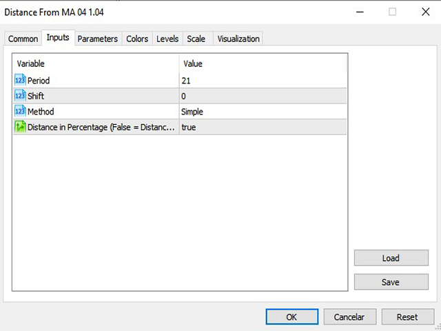
The “Moving Average Distance Indicator” calculates the difference between the instrument's price and the moving average of your choice, showing this difference in percentage values or in price. In other words, it indicates how far the price is from the moving average.
What is it for?
The great advantage of this indicator is the ease to compare movement expansions that occurred in the past, at different price levels, as the indicator works in a levelled way. The moving average remains flat on the indicator (level zero), while the oscillating line represents the price difference in relation to this average. The indicator shows positive values when the instrument’s price is trading above the moving average, and negative values when trading below.
Expansion and compression of moving averages
The relationship between price and moving average works like a rubber band: each time the price deviates from the average and the distance increases, the moving average exerts a force to "pull back", reducing this gap. The shorter the moving average period and the time frame, the more frequently and easily these movements will occur.
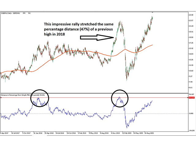
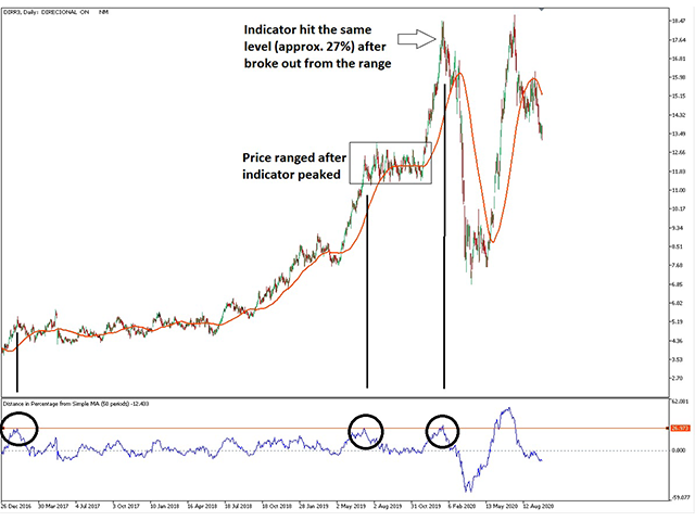
By analyzing a long period of time, it is possible to determine how far the asset is normally able to deviate from the moving average. If it is possible to identify several tops or bottoms in the same value range, they become important points of support or resistance, based purely on the movement of price expansion.
The “Moving Average Distance Indicator” can serve as a great tool to show whether an asset has reached a movement exhaustion, and could possibly lose its strength, start a range movement, or even initiate a movement in the opposite direction.
It is up to each trader to choose the moving average period and the time frame to work with, based on your knowledge in Technical Analysis, and considering your investment goals. Regardless of the chosen setup, we recommend viewing the chart zoomed away, in order to be able to visualize a longer period of time, to identify the best levels of support and resistance.
