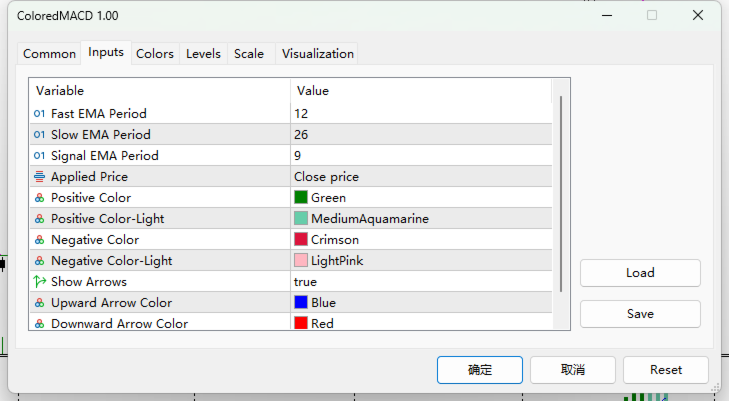
MultiColor MACD
- 지표
- Yun Fei Tang
- 버전: 1.0
- 활성화: 5
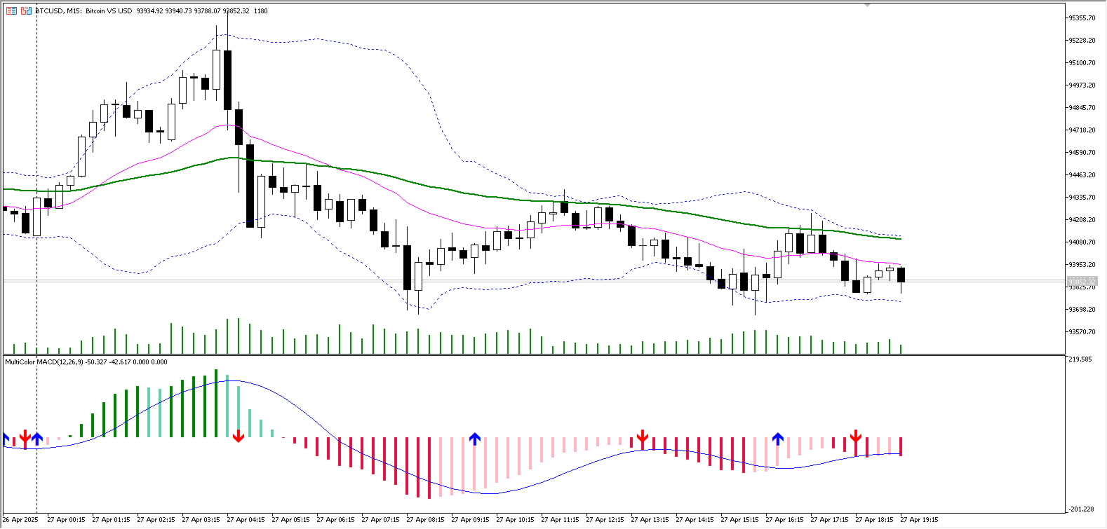
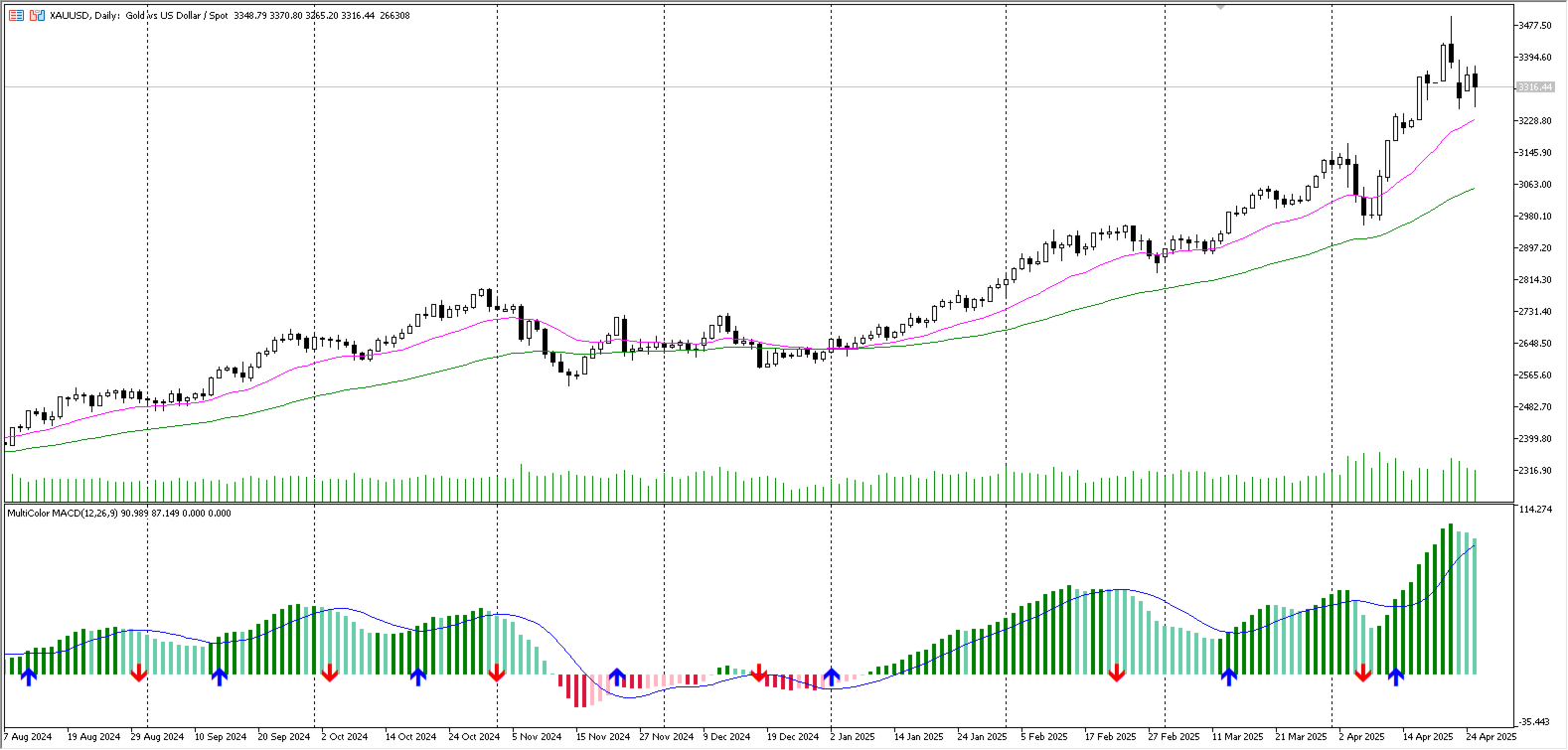
Based on the classic MACD indicator, this version introduces color concepts and adds golden/death cross arrow markers to represent MACD trend changes, helping investors make better decisions.
1. The MACD histogram bars display different colors when positioned above or below the zero line
2. When the MACD histogram is above the zero line and the current MACD value is greater than the previous value, it displays in dark color, indicating a continuing upward trend
3. When the MACD histogram is above the zero line and the current MACD value is less than the previous value, it displays in light color, indicating a weakening upward trend
4. When the MACD histogram is below the zero line and the current MACD value is greater than the previous value, it displays in light color, indicating a weakening downward trend
5. When the MACD histogram is below the zero line and the current MACD value is less than the previous value, it displays in dark color, indicating a continuing downward trend
6. Added golden cross and death cross arrow markers
7. An upward arrow appears when the current MACD value is greater than the signal line value, and the previous candle's MACD value was less than or equal to the signal line value
8. A downward arrow appears when the current MACD value is less than the signal line value, and the previous candle's MACD value was greater than or equal to the signal line value
This is a first attempt at indicators market by an investor who has suffered losses. Any suggestions are welcome.
Hope everyone can support this work.