Stationarity indicator and how to see if the market is moving with commitment
UPDATED indicator: v 1.01
I simplified this indicator, and it runs faster now. This is essentially a flexible RVOL indicator that will also show high low ranges. It uses stationarity to average candles (from day to day, or by a number of weeks, or months) instead of straight adjacent averages.
The high-low range is a variation which selects the MAX of the following, combining true range with close-close:
- high to low in this candle
- close of prior candle to high of this candle
- close of prior candle to low of this candle
- close of prior candle to close of this candle
Cleaned up the following:
- works in the strategy tester
- made the code more efficient (inspiration thanks to Darwinex)
- combined close-to-close with high-low, code now chooses between the max of the options
- removed close-to-close and ticks per point they did not add much value
- fewer input choices simplifies use
- quality of life - subtler colors, auto adjusting scale
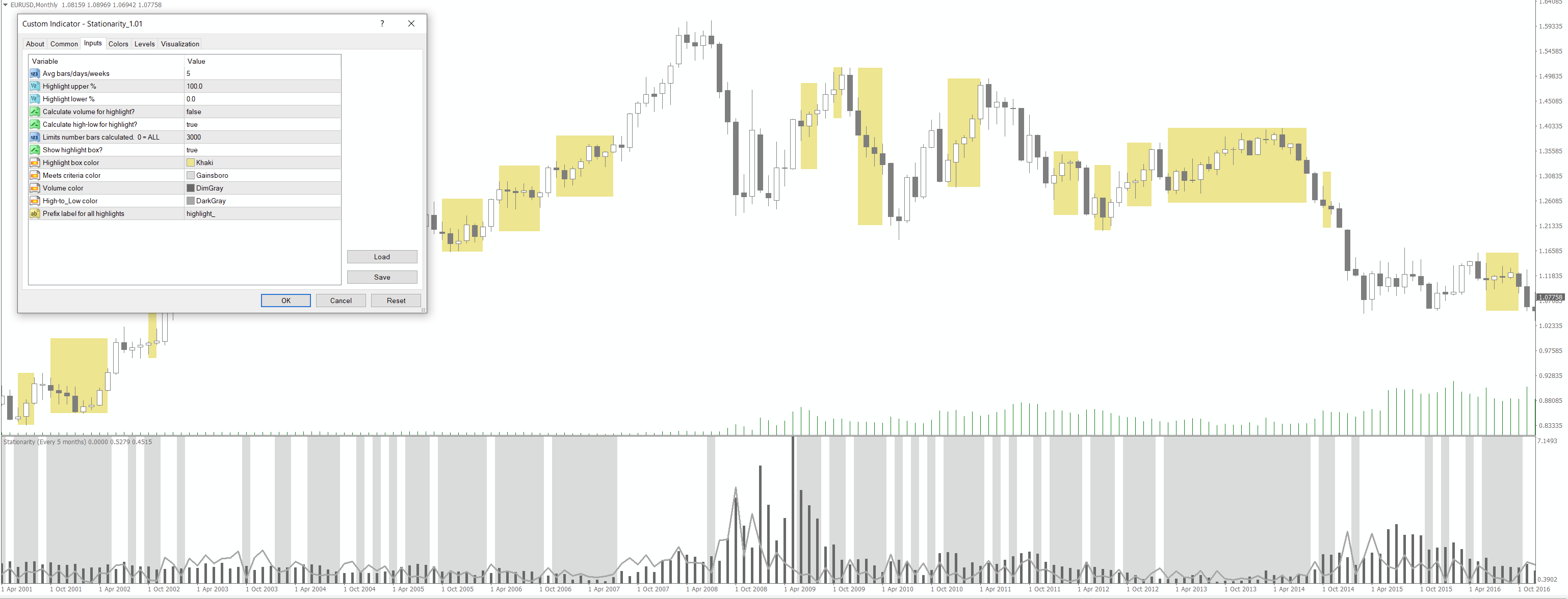
Please note that when setting the levels, 1.0 or 100 = average for the length chosen. So if you're looking for below average candles, you can choose upper = 80, lower = 0 for instance (or 0.80 and 0.0). To find above average values: upper = whatever limit you like with lower = 100. The screenshot shows an averaging of every 5 months, showing below average high-low candles. Note that if a single candle meets the criteria, a highlight box will not draw, as its 0 pixels wide, but this still shows in the bottom pane and in the "meets criteria?" field (defaults to 20, but as long as it isn't 0, it meets the criteria).
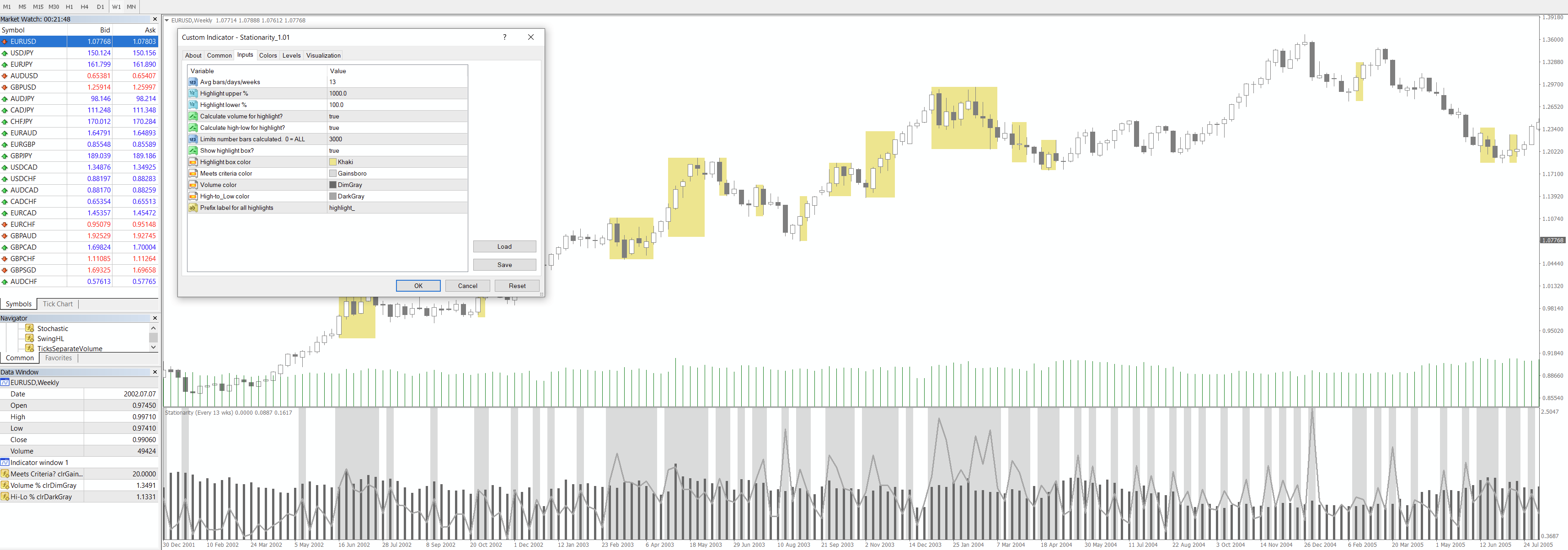
Here is another screenshot showing the data window indicator values in lower left, and a weekly chart with 13 weeks (1 yearly quarter) highlighting everything from average to 10x average (1000 in upper%, 100 in lower%)
Find the updated indicator attached. Hope you find it a useful variation of the RVOL
- Free trading apps
- Over 8,000 signals for copying
- Economic news for exploring financial markets
You agree to website policy and terms of use
Here is an indicator for anyone who is interested in using it. I created it both to practice some coding techniques and also to be able to have a look at some market dynamics that interest me. Maybe some of you will find it interesting as well. This was my first time really working with objects on the chart... I know that for some of you here on the forum, that's easy stuff. But I found it to be a challenge that I am still having a problem with. At the end I will discuss this.
I originally created it to help me determine if volume was moving with price "in a way that showed commitment". See a related Darwinex video here: https://www.youtube.com/watch?v=BPoBBSnKiVI
I am hoping to be able to use it to visualize consolidations, ranges, and of course breakouts. But, it also has the ability to view periods between M1 and D1 with stationarity. For instance, as opposed to an average of adjacent bars on the chart, if bar 0 is Monday it will only average the last x Mondays. Or, if bar 0 is 12:00:00, it will average the last x 12:00:00 candles. This allows us to see if this current candle is above or below the "typical" for that day or time. All values are shown in percentile (ie: a candle is 0.9 (or 90) percentile compared to historical candles defined in the ranges "Smoothing/averaging" and "Lookback for Percentiles")
It looks at a few price actions and volume metrics:
Inputs highlighted in red:
Inputs highlighted in blue:
Here is an example screenshot showing some settings and how they highlight on screen.
Note the gray bars at the bottom, they indicate whether or not your criteria have been met (ie: the inputs in the blue section above). If so, there is a gray bar. This way you can turn off the highlighting and still see if the criteria are met. In this case my criteria are to find candles where volume averaged stationarily is below 20%. Interestingly, tall candles are found - this means compared to other historical 9 am candles they are in the bottom 20%ile.
If you want to use it programmatically, you can use the 0th output array to show either it meets criteria or not, followed by 1 for cls-cls, 2 for hi-lo, etc. For on screen use, I show the colors as having several lines gets confusing to read.
I have learned a lot about the data while making this. Play around with it. I hope others find it useful. If you find errors, please let me know, as I would like to fix them. I will be converting this to MT5 soon.
====================================================
For other coders: can you help with this issue?
I notice that when changing timeframes (ie: from M1 to M15 using the MT4 interface buttons)
The indicator shows the below errors as if its trying to overwrite pre-existing objects. But, I cannot figure out how to fix this. The code is attached for anyone to compile. If you have any idea, please let me know.