Back testing
On clicking those dots it should highlight the row in optimization result. You can export the list into excel and filter the best settings based on drawdown and profit. When you find the best settings in excel, then search that in this result. then right click on the row-> Run Single Result
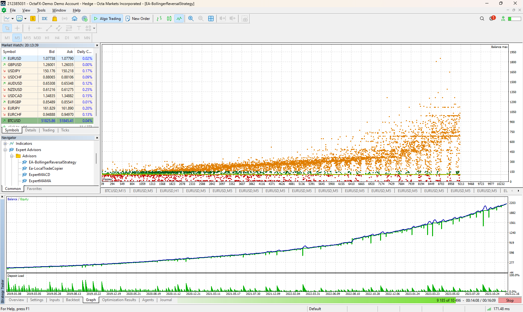
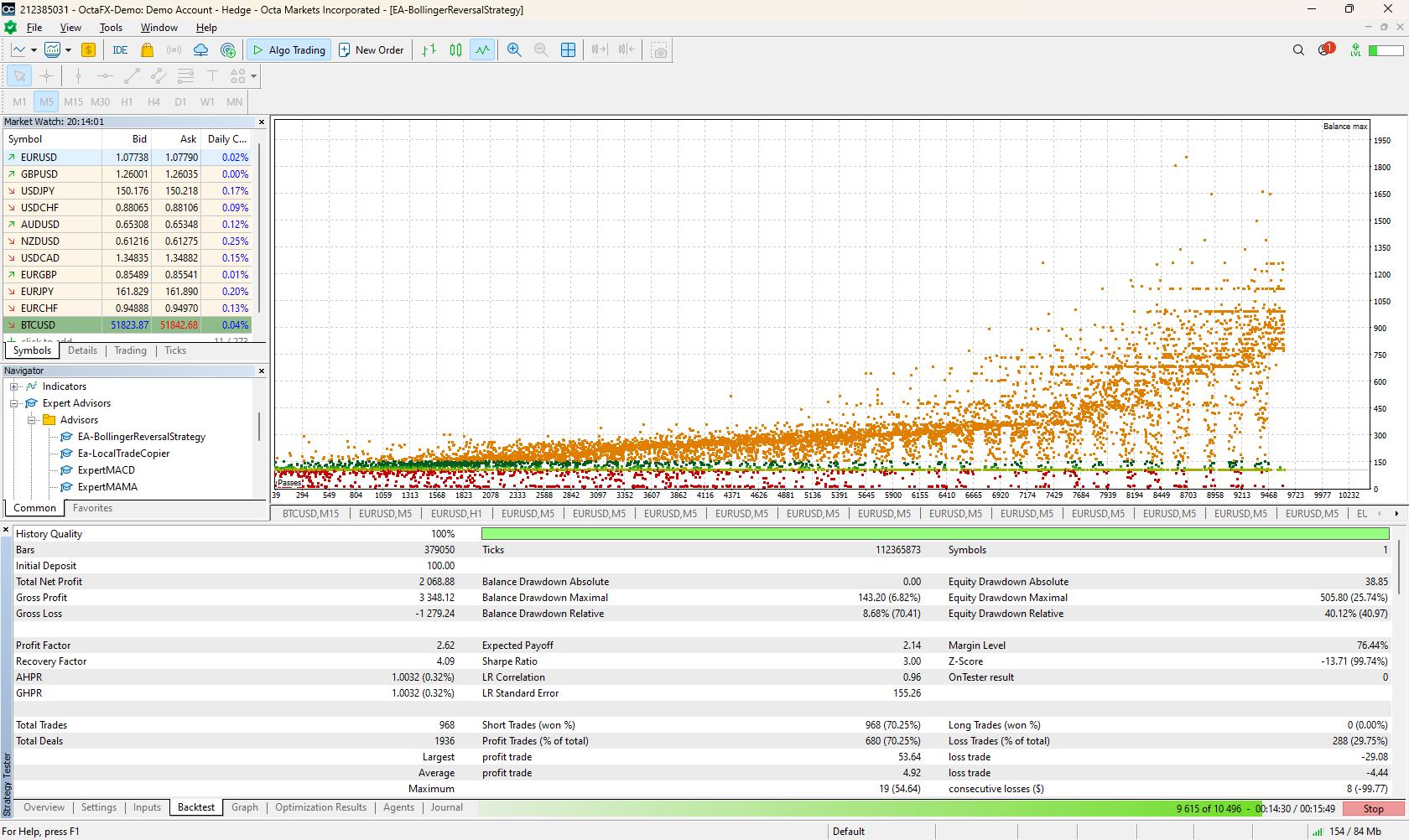
Check the graph and backtest result
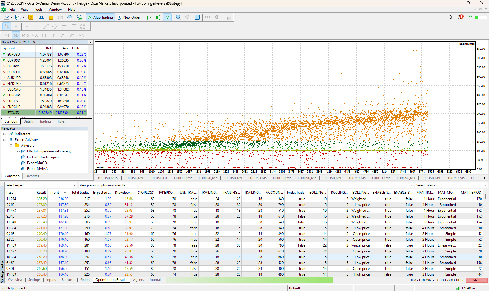
How do I read a back test on my program, I know it's profitable but I don't know how profitable, there are small squares on the graph, how do I proceed?
A few things you can look for here, i set it out below:
Single test:
-
Equity Curve:
- Description: The equity curve is a graphical representation of the account balance over time. It shows the cumulative profits and losses generated by the trading strategy during the backtest period.
- What to Look For:
- Smoothness: A smooth equity curve indicates consistent profitability with minimal fluctuations.
- Upward Trend: Ideally, the equity curve should exhibit an upward trend, reflecting overall positive performance.
- Volatility: Excessive volatility in the equity curve may indicate high risk or erratic trading behavior.
-
Balance Line:
- Description: The balance line represents the actual cash balance of the trading account, excluding unrealized profits and losses from open positions.
- What to Look For:
- Consistency: The balance line should closely track the equity curve, indicating accurate representation of account balance.
- Divergence: Significant divergence between the equity curve and balance line may signal discrepancies in accounting or position management.
-
Drawdowns:
- Description: Drawdowns represent periods of decline in the account balance from peak to trough. They indicate the extent of losses experienced by the trading strategy.
- What to Look For:
- Depth: Evaluate the magnitude of drawdowns relative to peak account balance. Large drawdowns may suggest high risk or poor risk management.
- Duration: Assess the length of drawdown periods. Prolonged drawdowns may indicate a lack of strategy robustness or resilience.
-
Recovery Periods:
- Description: Recovery periods occur when the equity curve rebounds from drawdowns and begins to recover. They represent periods of positive performance following losses.
- What to Look For:
- Speed of Recovery: Evaluate how quickly the equity curve recovers from drawdowns. Faster recovery indicates stronger resilience and adaptability.
- Magnitude of Recovery: Assess the extent to which the equity curve surpasses previous peak levels during recovery periods.
-
Peak and Trough Points:
- Description: Peak points represent the highest account balance achieved during the backtest period, while trough points represent the lowest account balance.
- What to Look For:
- Distance between Peaks and Troughs: Analyze the distance between peak and trough points to understand the severity of drawdowns and the volatility of the strategy.
-
Trade Markers:
- Description: Trade markers indicate the timing of individual trades, including entry and exit points. They provide visual cues for analyzing trading activity.
- What to Look For:
- Trade Frequency: Assess the frequency of trades and their distribution over time. Look for patterns or clustering of trades that may indicate specific market conditions or trading opportunities.
-
Performance Metrics:
- Description: Performance metrics such as net profit, maximum drawdown, profit factor, Sharpe ratio, etc., quantify various aspects of the strategy's performance and risk.
- What to Look For:
- Net Profit: Evaluate the overall profitability of the strategy.
- Maximum Drawdown: Assess the largest decline in account balance experienced by the strategy.
- Profit Factor: Measure the ratio of gross profit to gross loss, indicating the strategy's ability to generate profits relative to losses.
- Sharpe Ratio: Evaluate the risk-adjusted return of the strategy, considering both returns and volatility.
When analyzing the backtest graph and its components, it's essential to consider them in conjunction with each other to gain a comprehensive understanding of the strategy's performance, risk, and behavior. Additionally, compare the results against your predefined trading objectives and risk tolerance to determine the suitability of the strategy for live trading.
For Optimization you can pay attention to these:
-
Parameter Space Visualization:
- Description: The optimization chart includes scatter plots or like you said (small squares) or heatmaps that visualize the parameter space explored during optimization. Each point on the chart represents a combination of parameter values tested during the optimization process.
- What to Look For:
- Clustering: Look for clusters of points in the parameter space, indicating regions with favorable performance. These clusters may suggest optimal parameter combinations.
- Spread: Assess the spread of points across the parameter space. A wide spread suggests thorough exploration, while a narrow spread may indicate limited parameter ranges or insufficient sampling.
-
Performance Metrics Visualization:
- Description: Optimization charts may display performance metrics such as net profit, drawdown, profit factor, etc., for each parameter combination tested during optimization.
- What to Look For:
- Optimal Regions: Identify regions of the parameter space associated with high-performance metrics. These regions represent promising parameter combinations for further analysis.
- Trade-offs: Evaluate trade-offs between different performance metrics. For example, a parameter set may yield high profits but also high drawdowns, indicating a need to balance risk and reward.
-
Optimization Surface:
- Description: In some cases, optimization charts visualize an optimization surface, representing the relationship between parameter values and a performance metric such as net profit or Sharpe ratio. This surface may be displayed as a contour plot or 3D surface.
- What to Look For:
- Peaks and Valleys: Identify peaks on the optimization surface, indicating regions with optimal performance. Conversely, valleys represent suboptimal parameter combinations.
- Sensitivity: Evaluate the sensitivity of performance metrics to changes in parameter values. Steep slopes indicate high sensitivity, while flat regions suggest stability.
-
Parameter Sensitivity Analysis:
- Description: Optimization charts may include sensitivity analysis plots, showing how performance metrics vary with changes in specific parameters while holding others constant.
- What to Look For:
- Sensitivity Trends: Analyze how performance metrics change with variations in individual parameters. Identify parameters with significant impacts on strategy performance.
- Interaction Effects: Look for interactions between parameters, where the performance of one parameter depends on the value of another. Understanding these interactions can refine parameter selection.
-
Optimization Criteria Visualization:
- Description: Some optimization charts visualize the optimization criteria used to select the best parameter combination. This may include charts showing the distribution of optimization criteria values across parameter combinations.
- What to Look For:
- Optimal Criteria Values: Identify parameter combinations associated with the best optimization criteria values. These combinations represent potential candidates for deployment in live trading.
- Consistency: Assess the consistency of optimization criteria values across parameter combinations. Consistent criteria values suggest robust optimization results.
When interpreting an optimization chart, it's essential to consider the goals of your optimization process, the performance metrics that matter most to your trading strategy, and any constraints or considerations specific to your trading objectives. Additionally, validate promising parameter combinations through out-of-sample testing or robustness checks before deploying them in live trading.
Now for 2D and 3D charts this is what you want to look for:
2D Optimization Chart:
-
Parameter Axes: In a 2D optimization chart, each axis represents a parameter that was varied during the optimization process. For example, if optimizing two parameters (e.g., lot size and stop loss), one parameter will be represented on the x-axis, and the other on the y-axis.
-
Performance Metric: The color or shading of data points on the chart represents a performance metric such as net profit, drawdown, or profit factor. Darker or brighter colors often indicate better performance, while lighter colors may represent poorer performance.
-
Data Points: Each data point on the chart corresponds to a specific combination of parameter values tested during optimization. The position of the data point indicates the values of the parameters, and the color or shading indicates the associated performance metric.
-
Contours or Regions: Some 2D optimization charts may include contour lines or shaded regions that delineate areas of similar performance. Contour lines connect data points with equal performance metric values, helping identify regions of optimal parameter combinations.
-
What to Look For:
- Optimal Regions: Identify clusters or areas of the chart with darker or brighter colors, indicating regions of superior performance. These areas represent promising parameter combinations to explore further.
- Parameter Sensitivity: Analyze how changes in parameter values affect the performance metric. Look for trends or patterns in performance as parameters are varied.
3D Optimization Chart:
-
Parameter Axes: Similar to the 2D chart, the axes in a 3D optimization chart represent parameters varied during optimization. In this case, there are three axes, each representing a different parameter.
-
Performance Metric: The data points in a 3D optimization chart are represented by coordinates in three-dimensional space, with the position indicating the values of the three parameters being optimized. The color or shading of the data points represents the associated performance metric.
-
Data Points: Each data point in the 3D chart corresponds to a specific combination of parameter values and their associated performance metric. The position of the data point in 3D space indicates the values of the parameters, and the color or shading indicates the performance metric.
-
Surface Plot: In some 3D optimization charts, a surface plot is used to visualize the optimization results. This surface represents the relationship between parameter values and the performance metric, with peaks indicating regions of optimal performance.
-
What to Look For:
- Optimal Regions: Identify peaks or high points on the surface plot, indicating regions of superior performance. These areas represent promising parameter combinations for further analysis.
- Parameter Sensitivity: Evaluate how changes in parameter values affect the shape and contour of the optimization surface. Identify parameters with significant impacts on performance.
On clicking those dots it should highlight the row in optimization result. You can export the list into excel and filter the best settings based on drawdown and profit. When you find the best settings in excel, then search that in this result. then right click on the row-> Run Single Result
Check the graph and backtest result
Thanks for a job well done, I don't know how to thank you, myyyyyyyyyyyyyy thanks to you.
- Free trading apps
- Over 8,000 signals for copying
- Economic news for exploring financial markets
You agree to website policy and terms of use