

Three major types of charts
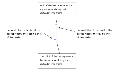
1. Bar Charts
Bar charts provide traders with four key pieces of information for a
given time frame: the opening price during that time frame; the closing
price; the high price; and the low price.
2. Candlestick Charts
The candlestick charts were invented by the Japanese in the 1700s.
Just like a bar chart, a candlestick contains the market's open,
closing, low and high price of a specific time frame. The main
difference is the candlestick's body part, which represents the range
between the opening price and the closing price of that particular time
frame. When the body part is filled with red (or black), it means the
closing is lower than the opening. When the body part is filled with
blue (or white), it means the closing is higher than the opening. While
the bar charts put more emphasis on the progression of closing price
from the last bar to the next, while the candlestick charts put more
emphasis on the relationship between the opening and the closing price
within the same time frame.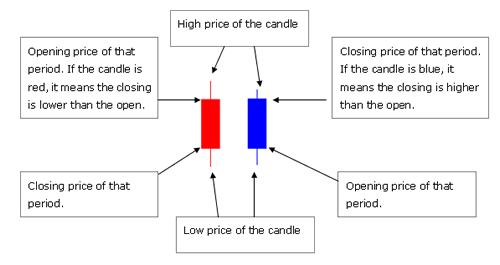
3. Line Charts
Unlike bar and candlestick charts, line charts present much less information; they only show the closing price for a series of periods. As a result, line charts serve best to measure the overall direction of long-term trends, and hence are of limited used for most traders.


")