MACD Color Histogram
- Göstergeler
- German David Nino Cifuentes
- Sürüm: 2.0
- Güncellendi: 31 Mayıs 2024
- Etkinleştirmeler: 5
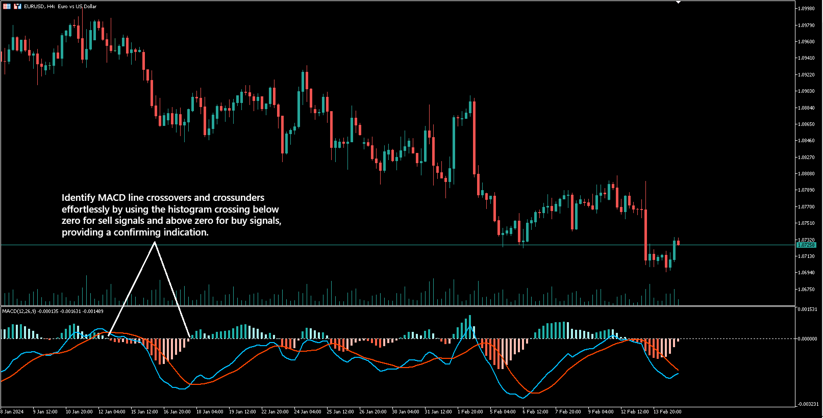
MACD Histogram göstergesi, traderların piyasa trendlerini ve momentum değişikliklerini daha iyi anlamalarını sağlamak için tasarlanmış, MACD göstergesinin güncellenmiş bir versiyonudur. Orijinal MACD'den farklı olarak, bu versiyon iki çizgi arasındaki farkı gösteren bir çubuk grafik olan bir histogram içerir: MACD çizgisi ve sinyal çizgisi.
Nasıl çalıştığına gelince: MACD çizgisi sinyal çizgisinin üzerinde olduğunda, yükseliş piyasasını önerir ve histogram çubukları yeşil renkte gösterilir. Öte yandan, MACD çizgisi sinyal çizgisinin altında olduğunda, düşüş piyasasını gösterir ve histogram çubukları kırmızıya döner.
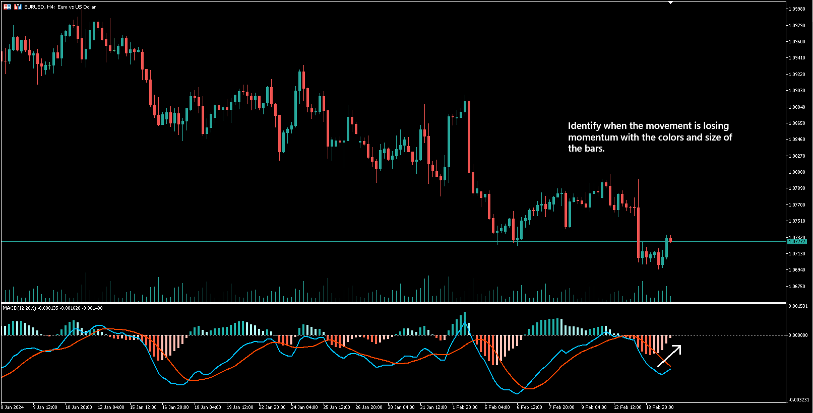
MACD Histogram göstergesinin ilginç yanı, piyasa momentumu değiştikçe çubukların renklerinin değişmesidir. Yani, yükseliş momentumundan düşüş momentumuna bir geçiş olduğunda, çubuklar yeşilden kırmızıya döner ve tersi de geçerlidir.
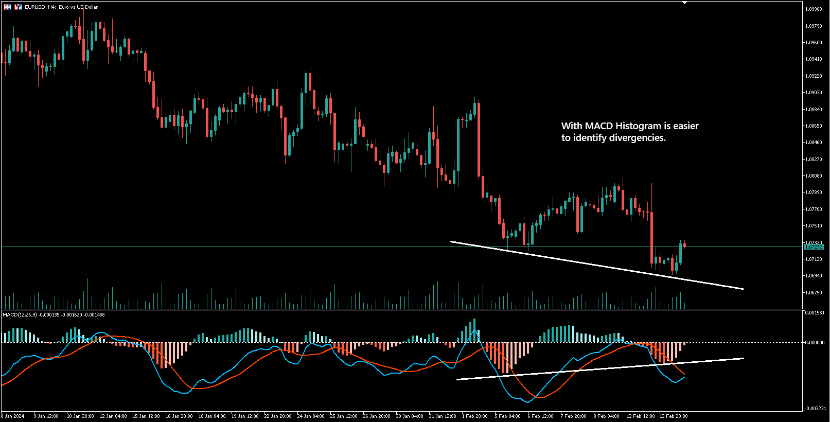
Bir diğer kullanışlı özellik ise, fiyat hareketleri ile MACD göstergesi arasındaki farkları tespit etmeyi kolaylaştırmasıdır, çiftteki olası sapmaları vurgulayarak, potansiyel piyasa dönüşlerini işaret edebilir.
Gösterge ayrıca, kullanıcının tercihine göre MACD ve Sinyal çizgilerini ve histogramı gizleyebilir, bu da göstergenin özelleştirilmesini ve esnekliğini artırır.
Özetle, MACD Histogram göstergesi, traderlara piyasa trendlerini analiz etmenin daha basit bir yolunu sunar, net görsel sinyaller ve renk değişiklikleri ile daha bilinçli ticaret kararları almalarına yardımcı olur.
excellent indicator