You are missing trading opportunities:
- Free trading apps
- Over 8,000 signals for copying
- Economic news for exploring financial markets
Registration
Log in
You agree to website policy and terms of use
If you do not have an account, please register
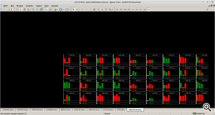
I am attaching a picture in which I have circled all pairs of daily charts with a red line. They clearly show that if the colours are the same (red with red or green with green) then it is a flat state. If the colours are different, it is a trend state. In the centre below is the monthly chart, which shows the long-term direction.
No one seems to be interested!
Nobody seems to be interested!
Why not, we're just observing.
Why not, we're just observing.
If you're interested, I can send you the whole set for this version of the picture
Hi All!
Here is a clearer version of the All_against_all_v4 indicator. I am attaching, along with the indicator and the template, a picture of the 4 main indicators: USD; GBP; EUR; CHF. The others do not play major roles in the market.
Quite strange, no criticism or feedback, it feels like everyone has died out!
I looked, but without a description of the indicator and how to use it, I still don't get it.
I looked, but without a description of the indicator and how to use it, I still don't get it.
as with most - look closely at the bars and flip a coin
Is it not clear? You are observing, it is not clear now. It's very clear there. Each of the 4 currencies shows how strong it is relative to the other currencies from the list, starting with a 1-minute chart and ending with a monthly chart. The main direction of course is on the monthly chart. Want to add more currencies, please open the code and add them!
And for those who aren't quite clear (or lazy;), can you tell me exactly what conclusion to draw from your picture?