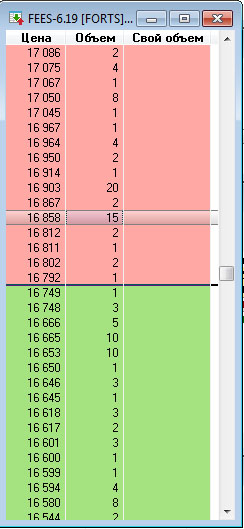
I am writing a price tumbler for the CODO BASE and am confronted with a misunderstanding of what it should be. I drew the standard base - three columns, asc, bid and price. But what to add further to it?
Who knows, please advise.
Here is the draft.
From the picture you can see that you've never worked with the glass.
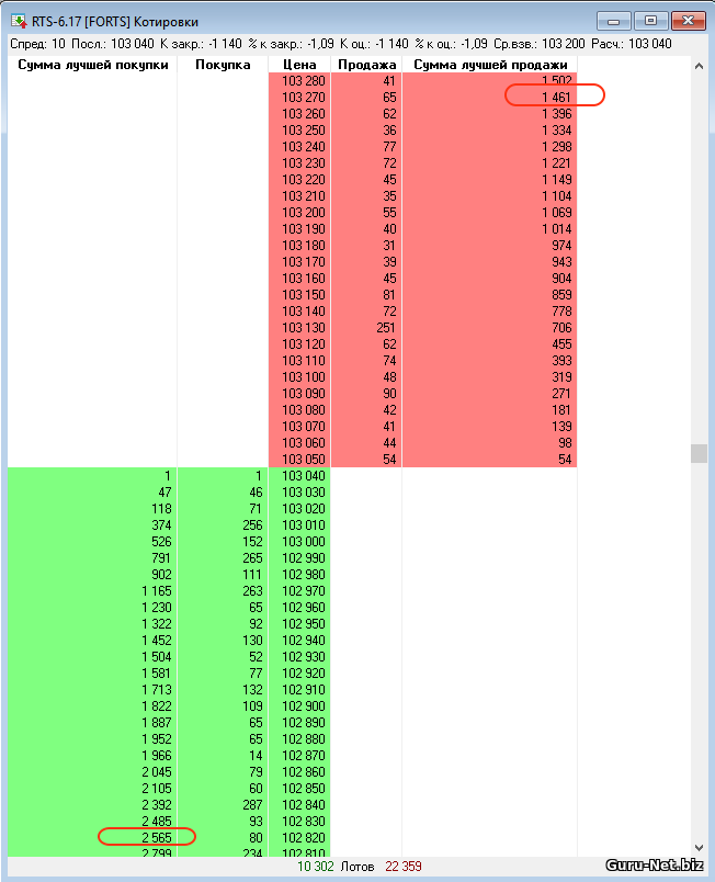
This is what a standard glass looks like

Top ASK, bottom BID
Added
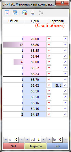
And this is how the cup looks like in MT5

You can see from the drawing that you have never worked with a tumbler
This is what a standard glass looks like
Top ASK, bottom BID
Added
And this is how the cup looks like in MT5
You are not quite right. I worked with the price tumblr a long time ago. It was on the TWS and NJ platform. Structurally my tumbler is similar to those tumblers because I was used to them then. The configuration of MT cup is not quite clear to me. Asc is always at the top and bid at the bottom and to combine them in one column is not very convenient in my opinion.
The whole world uses this particular tumbler configuration, BUT
You know best....
Yes, buttons can be added, like in the trading panels. I see too much empty space, it should be cut. Better yet, make the visual part fully customizable.
Asc is always at the top, and bid is always at the bottom and it's not very convenient to combine them in one column in my opinion.
It's all customizable in Quicksilver, you can make any configuration of a cup.
The whole world uses this particular tumbler configuration, BUT
You tell me.....
Here found my configuration.

Here's my configuration.
You know best... But then why did you ask?
Yes, buttons can be added, like in the trading panels. I see too much empty space, it should be cut. Even better - make the visual part fully customizable.
It's all adjustable in QuickBooks, you can make any configuration of the tumbler.
You know best... But then why did you ask?
The TWS tumbler seemed to have a histogram, but I don't remember what it showed...
There was also an L2, but it doesn't seem to be in the MT.
And so:
1. Add buy, sell, lot, take and stop buttons (that's easy).
2. Set pending by click on cell and close by click on cross (need to think about it).
3.?
4.?
...?
- Free trading apps
- Over 8,000 signals for copying
- Economic news for exploring financial markets
You agree to website policy and terms of use
I am writing a price tumbler for the CODO BASE and am confronted with a misunderstanding of what it should be. I drew the standard base - three columns, asc, bid and price. But what to add further to it?
Who knows, please advise.
Here is the draft version.