From theory to practice - page 139
You are missing trading opportunities:
- Free trading apps
- Over 8,000 signals for copying
- Economic news for exploring financial markets
Registration
Log in
You agree to website policy and terms of use
If you do not have an account, please register
Illustration of the above with fresh data
EURUSD W1 chart
Zone 1: A lot of long entry attempts will be made on this strategy. The drop was 4000 pips
Zone 2: might be and will work
Zone 3: a small pullback, but after 2000 pips.
Take another close look at the lower incremental graph relative to the price itself (upper graph)
The upper chart is not a price chart. The upper graph is an incremental graph and the lower one is the average incremental graph.
Who are you kidding?
The upper chart is not a price chart. The top one is the incremental chart and the bottom one is the average incremental chart.
Who are you kidding?
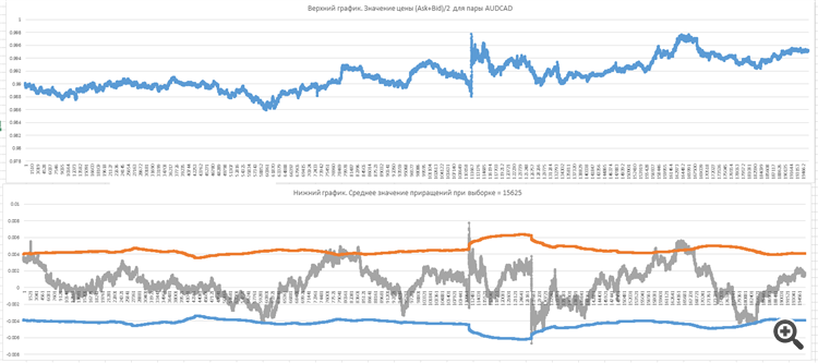
The upper chart is the chart of (Ask+Bid)/2 for the pair AUDCAD this week.
The lower one is yes, it is the average increments for the sample =15625, corrected the post.
At the weekend I will calculate in mql, but on minute bars. I'm not used to dealing with ticks, the hassle is more than the money.
There is no need to count. The whole pipsing has been based on this principle for a long time and it works perfectly. Well, on the intradecks it may be used somehow. On longer intervals this method does not work in principle.
A bicycle, however).
What's there to count? All pipsing has been based on this principle for a long time and it functions perfectly. Well, on the intradecks it is still possible to use it somehow. On longer intervals this method does not work in principle.
A bicycle, however).
Has everyone been working on an exponential timescale for ages? :)))))))))))))))
What's there to count? All pipsing has been based on this principle for a long time and it functions perfectly. Well, on the intradecks it is still possible to use it somehow. On longer intervals this method does not work in principle.
A bicycle, however).
When comparing two charts - upper and lower, I see not ONE losing deal. And 15625 ticks in exponent is about 8 hours, yes
The upper one is the (Ask+Bid)/2 chart for this week's AUDCAD pair.
Bottom one is yes, it is the average increments for sample =15625, corrected the post.
You are fooling yourself again.
Your top chart - This is not a price chart. Price cannot go negative. It is a graph of increments!
You're fooling yourself again.
Your top chart is not a price chart. Price can't go negative. It's an incremental chart!
Sergei, you're scaring me.
.
Time to get out of here, though!
When comparing the two charts, upper and lower, I don't see ONE losing trade. And 15625 ticks exponentially is about 8 hours, yes