Wall Street's Brightest Minds Reveal The Charts That Worry Them Most
This chart is not scary. It is the reality. And with each new "crisis" that the Davos boys manufacture in the future it will get "scary" as this
Files:
It can be worse. Soon they are going to ask us to pay them to work for them
seekers:
This chart is not scary. It is the reality. And with each new "crisis" that the Davos boys manufacture in the future it will get "scary" as this
This chart is not scary. It is the reality. And with each new "crisis" that the Davos boys manufacture in the future it will get "scary" as this
That even might be true. They use each "crisis" to lower or to "forget to raise because of inflation" wages, so we are just left with lower and lower income, while those charts are showing that profits went sky high. If it continues like this for some more time, soon that sentence will be true
techmac:
It can be worse. Soon they are going to ask us to pay them to work for them
It can be worse. Soon they are going to ask us to pay them to work for them
You are missing trading opportunities:
- Free trading apps
- Over 8,000 signals for copying
- Economic news for exploring financial markets
Registration
Log in
You agree to website policy and terms of use
If you do not have an account, please register
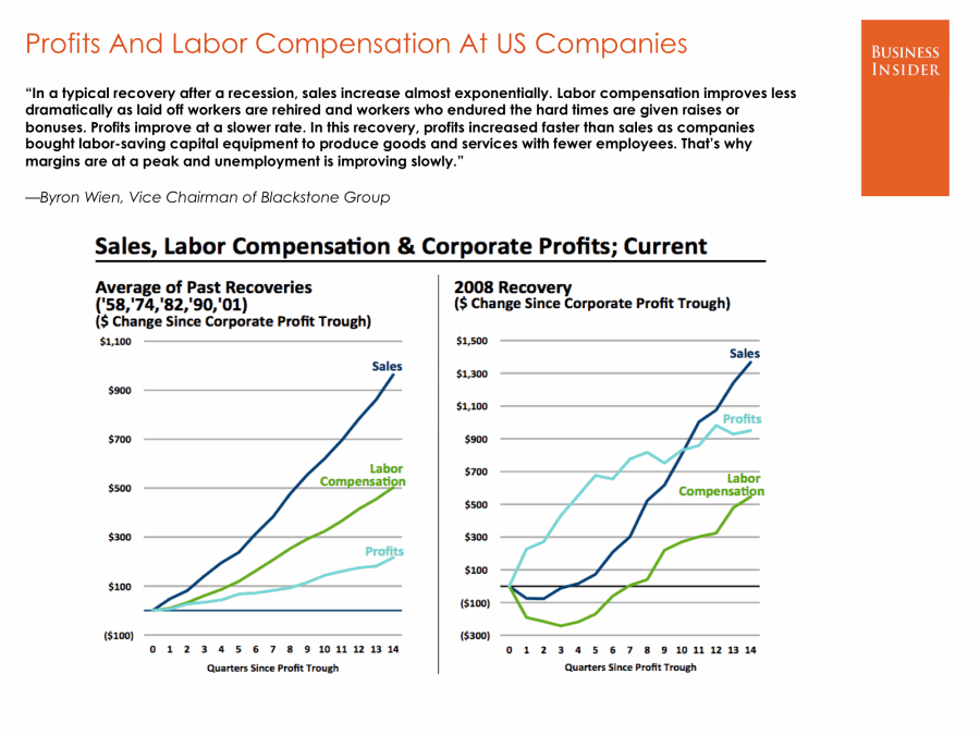
With optimism resurfacing over the global economy and the perception that major tail risks in the United States, the euro zone, and China have been mostly squared away, what's left to worry about?
We posed the question to our favorite analysts, economists, and traders across Wall Street – and we were surprised at the number of people who declined to give an answer, citing the fact that they just couldn't really think of anything.
However, we still got plenty of responses.
While general developments in the world's largest economies are encouraging, there may be several reasons to be concerned lurking just beneath the surface.
Let's go to the charts.
read more ...