Accumulation / Distribution "behind price"
you have to tell us more -- what is Accumulation / Distribution "behind price"
the GIF you show us is like LAG type of indicator -- which mean profiling the chart, the move the whole thing LEFT and draw the line -- most of those indicator shift it the RIGHT like stop and reverse MQ4 indicator -- and forex is more technical while goldman sach stock could be more NEWS triggered
Well,
I have to say that I am just a beginner and I don´t understand too much of what you said.
But a conclusion is, that it won´t be possible or useful for forex charts, and it is applicable only for stocks..?
My point was, that it could be simpler while looking for divergences to see it directly behind price, as using the crosshair tool in mt4 to see what exactly was the price at the time when A/D peaked.. My point is not to see the value, but the time more precisely and simply.
Another problem of A/D in separate window is, that if the window is too narrow, the A/D line is so pressed that the values just seems to be the same for different times, while the real difference can be significant.
But if you say that this is impossible, i am ok with that.
To compare, here are some stock charts where you can decide where you want to see the A/D line Accumulation Distribution Line - ChartSchool - StockCharts.com
Unfortunately Accumulation distribution type analysis only works on securities that have a relatively transparent and central marketplace. Since Forex is more often than not is OTC you can't get a view on volumes to do this type of analysis. Hence why the volume indicator is based on volume of ticks not actual volume of lots which is what's most important. Volume is misleading in FX as compared to other securities like stocks and futures. However if you have access to AD of currency futures you may be able to duplicate the actual process and implement that indicator on the futures to the spot market trades.
Hope that helps
-drgoodvibe
Okey, thank you, now I understand.
I didn´t know that the volume displayed on my forex chart is just a tick volume, not the real one. And I thought how great forex strategy have I found for myself..  Now when I studied how it works, my questions seems to be pretty stupid. Sorry for that.
Someone can explain me ...
How does this work for indicators with the trendline on the cci?
I read the explanation, but I could not bring out the trendline as shown in the screen, does anyone know how?
An Insight Into Accumulation/Distribution And Where It Can Get You - MQL4 Articles
Thanks
Hi daljuli,
As I understrand - it is something about how to estomate/to code about 2 trendline crossing built using A/D indicator and how it is associated with the line of this indicator. It may be interesting for programmers to code some EA or to code improved version of this standard metatrader indicator (improved A/D).
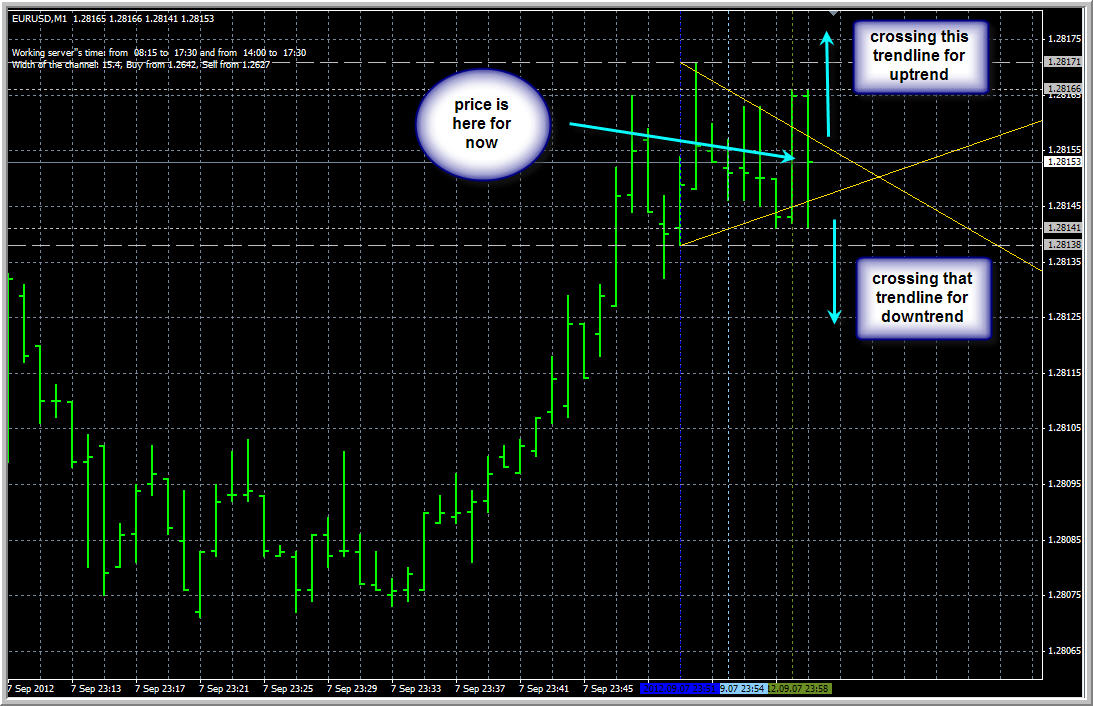
Because what is this '2 trendline crossing'?
It is some kind of price pattern (do not remember the name sorry).
The meaning of this crossing is the following:
if the price is inside 2 trendline crossing so ... if price will cross one opper line- it is indicating uptrend, the other line - for downtrend. Some traders are estimating the future possible trend.
Example for now:
- Free trading apps
- Over 8,000 signals for copying
- Economic news for exploring financial markets
You agree to website policy and terms of use
Hello,
I am searching for an A/D indicator which plot the line directly on the chart window "behind price", as is shown on link below.
Does anybody know where i could get it?
I can´t find it anywhere, but i think it could be helpful tool, as well as the same with on balance volume..
I would appreciate if somebody could post it here if it is possible.
I also like that idea of blanched volume indicator down on the background, it is clear to read, and not so disturbing as having it in a separate window below where it is taking the place to another tools.. Does anybody know where to get it?
link:
http://i.investopedia.com/inv/articles/site/AT-ADLine1.gif
Thank you very much