
Secondly there is no universally accepted methodology telling you where to use which indicator. Five different analysts can look at the same chart and make contradicting redictions and all of them successfully support their predictions with different indicators and lines. In the end one of them will be right maybe with pure luck. Is he the best analyst or the most lucky one?
The main problem with technical analysisis the assumption of “history repeats itself” and that future price movements are largely determined by previous movements called “trends” or “patterns”. Anyone who study finance at academic level knows there are numerous studies which test relation of future price movements and historical market data. So far, even there have been any relationship discovered between historical and future prices, they are extremely small that economically insignificant. Most basically correlation of past price changes with present and future price changes is very slightly positive and practically nearly zero.
So how can you explain trends and formations in the historical market data which seems to prove their selves? Here below two different charts which I’verandomly generated with MS Excel. I made Excel formula to give each cell a random value between -1 and +1 points for 5.000 cells and add those values starting from 10.000 points.
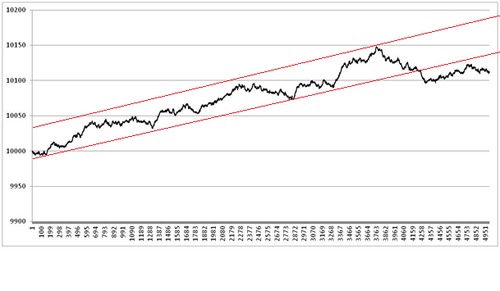
There seems to be clear up trend in the firstchart but in reality each point represents an independent event and it is pure luck that it keeps increasing. I can easily draw trend channels and support points.
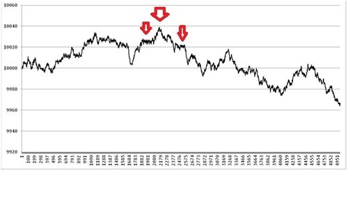
Second random chart seems to have a shoulderhead shoulder formation and a downtrend. You can easily generate random charts with any office or statistics software and see how it is similar to a currency pairs’ or S&P’s.
As a result I think, charts (historical pricedata), if used as the only tool in investment decisions can be misguiding and may result in severe losses. But I am sure there are people who made million dollars with a strategy solely based on technical analysis as there are people who won the lottery.


